5 Questions with Pretty Little Fawn

Get the Look

5 Questions with
@prettylittlefawn

Did you know Courtney Halverson, AKA @prettylittlefawn, is one of the first creators we worked with? Her style is perfect for this time of year, so we thought it was a great opportunity to take some time to chat about what inspires her. Let’s get to it!

What has been the biggest influence to your aesthetic?

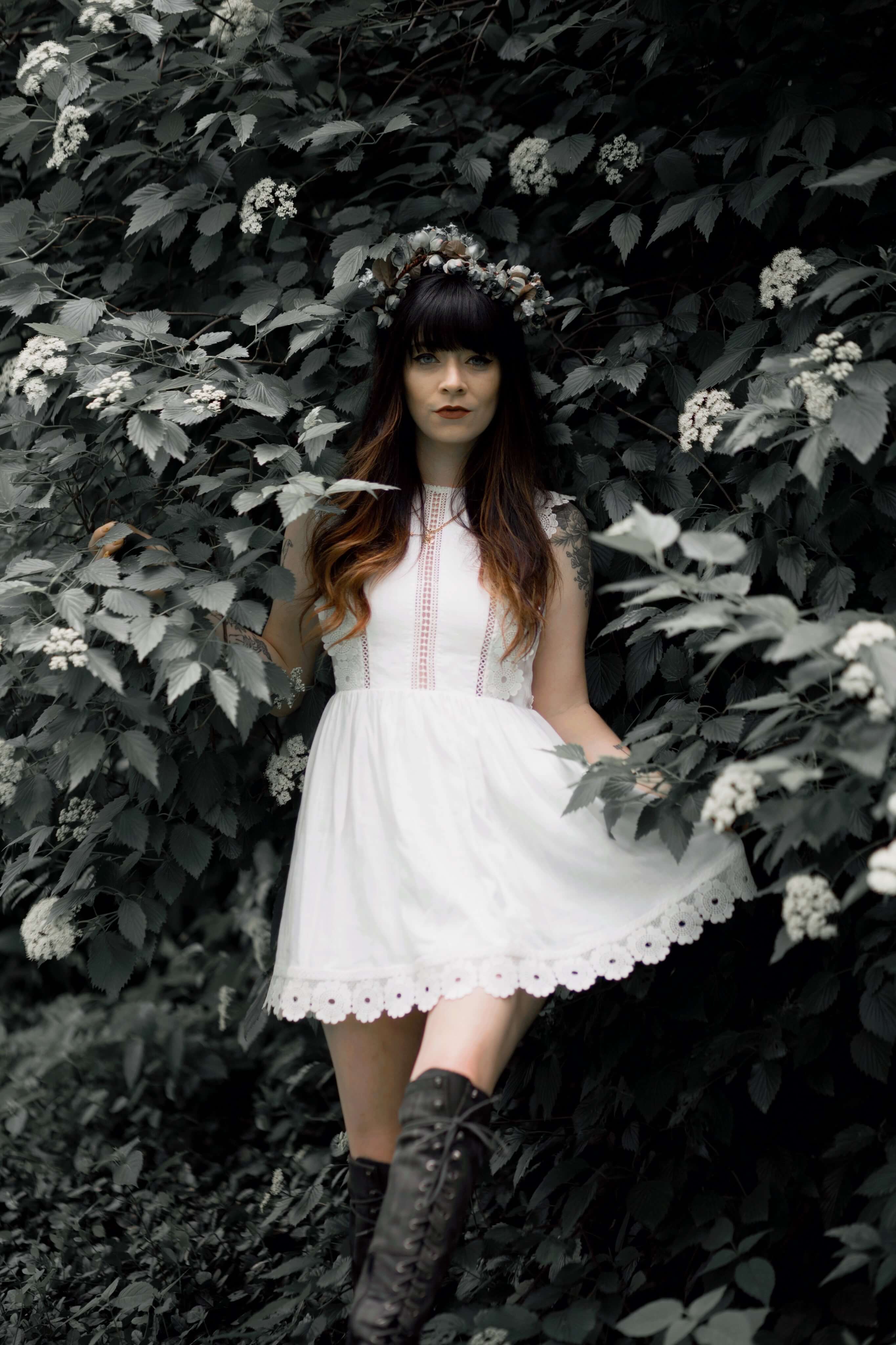
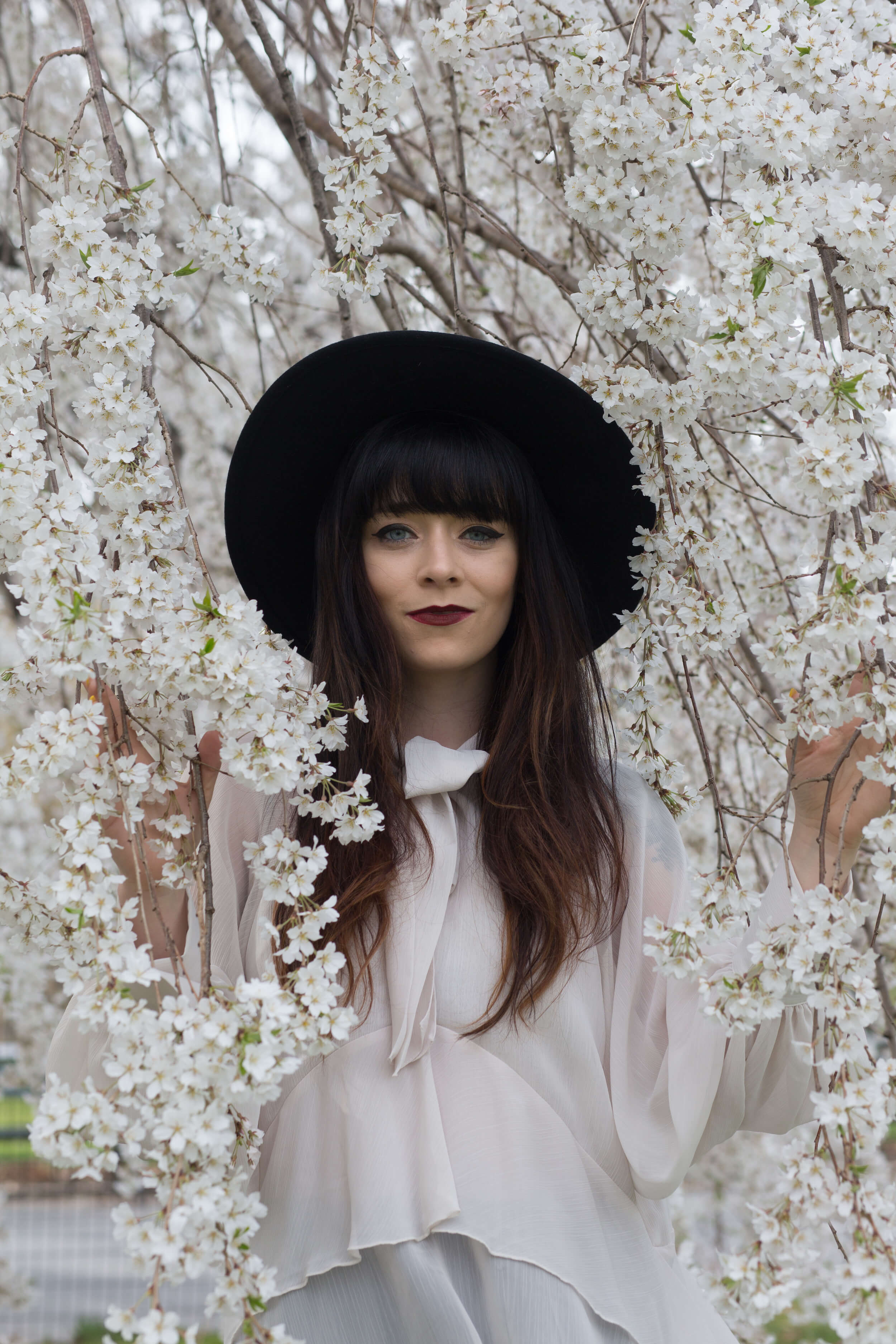
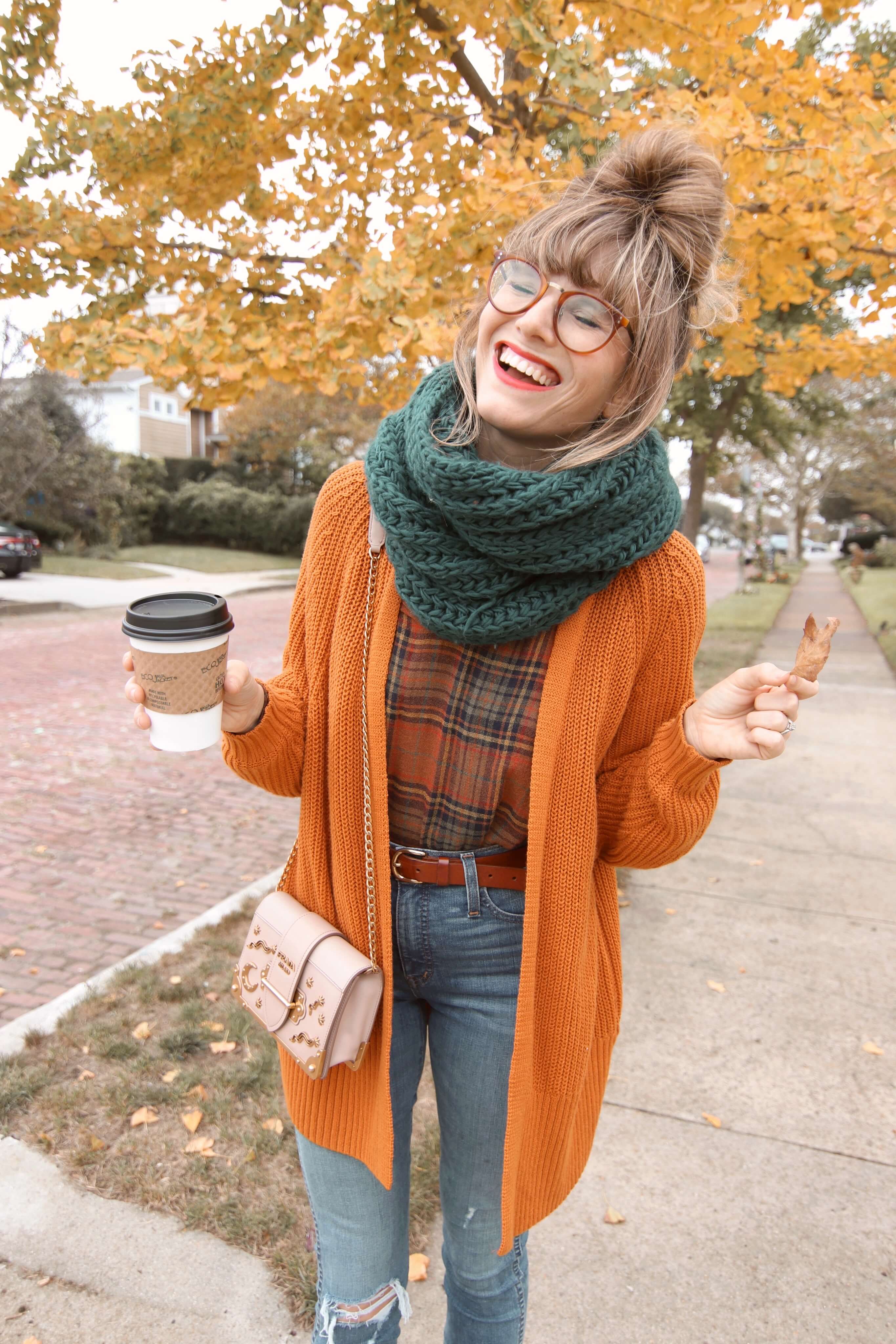
I think a big part of my aesthetic comes from my travels. Growing up in Southern California meant that my earliest fashion choices were based on what I knew — beachy styles and California casual clothing. I never really felt much of a connection to what I wore because it just didn’t feel like me. Once I started traveling and was exposed to more styles (and different climates!) my love of earth tones and knitwear grew. I don’t always get to bundle up in the styles I love in LA, but I take any chance to inject a bit of coziness into my wardrobe. It just feels romantic and timeless to me.

Give us a little insight into why you create.

I’ve always had a drive to express myself, and for me that began in the acting world. To create characters and to work in both film & television gave me a taste for seeing visions come to life. I think I love being able to also blog because it allows me to have a little more control over what I create – to have an idea that I get to see fully realized.

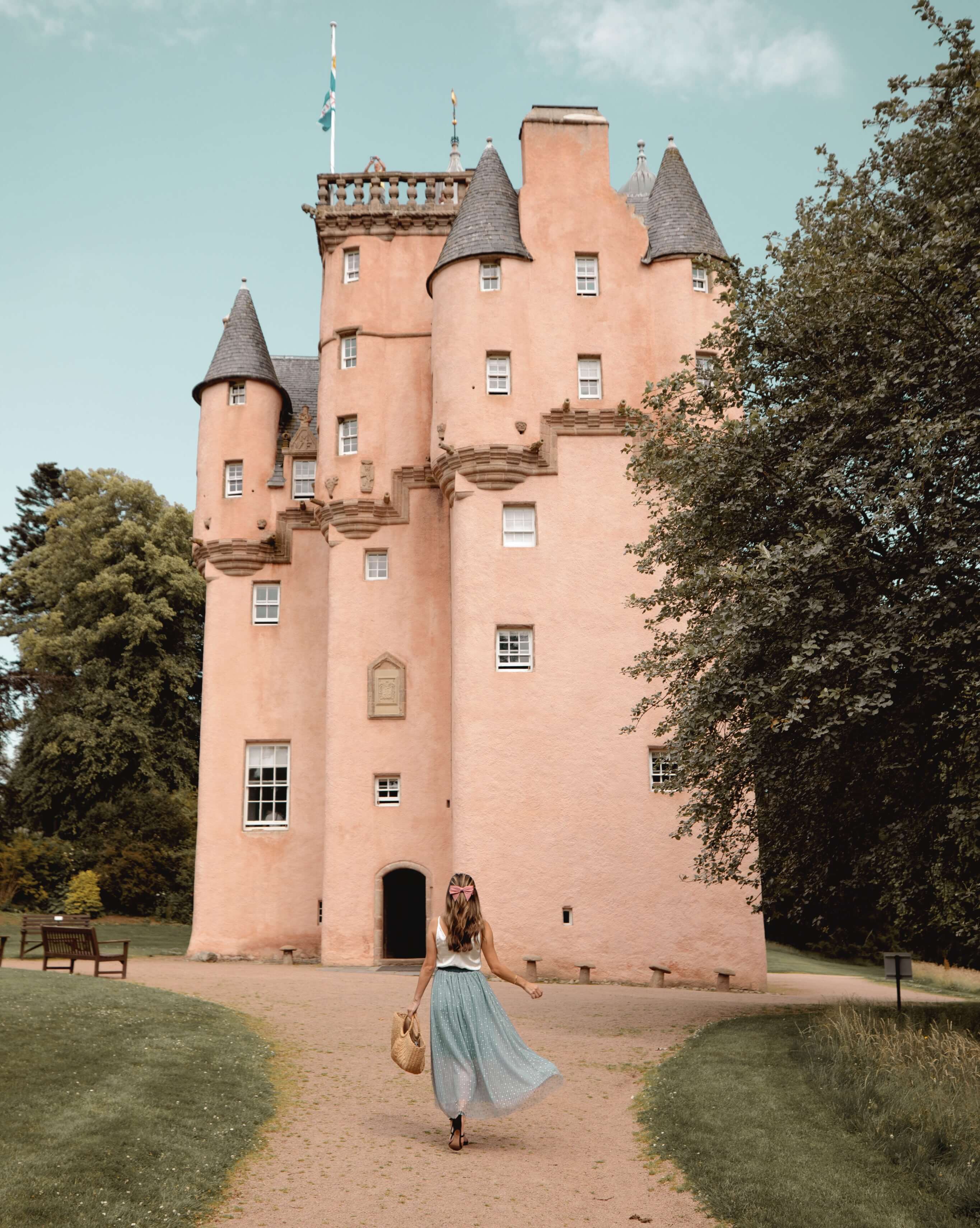
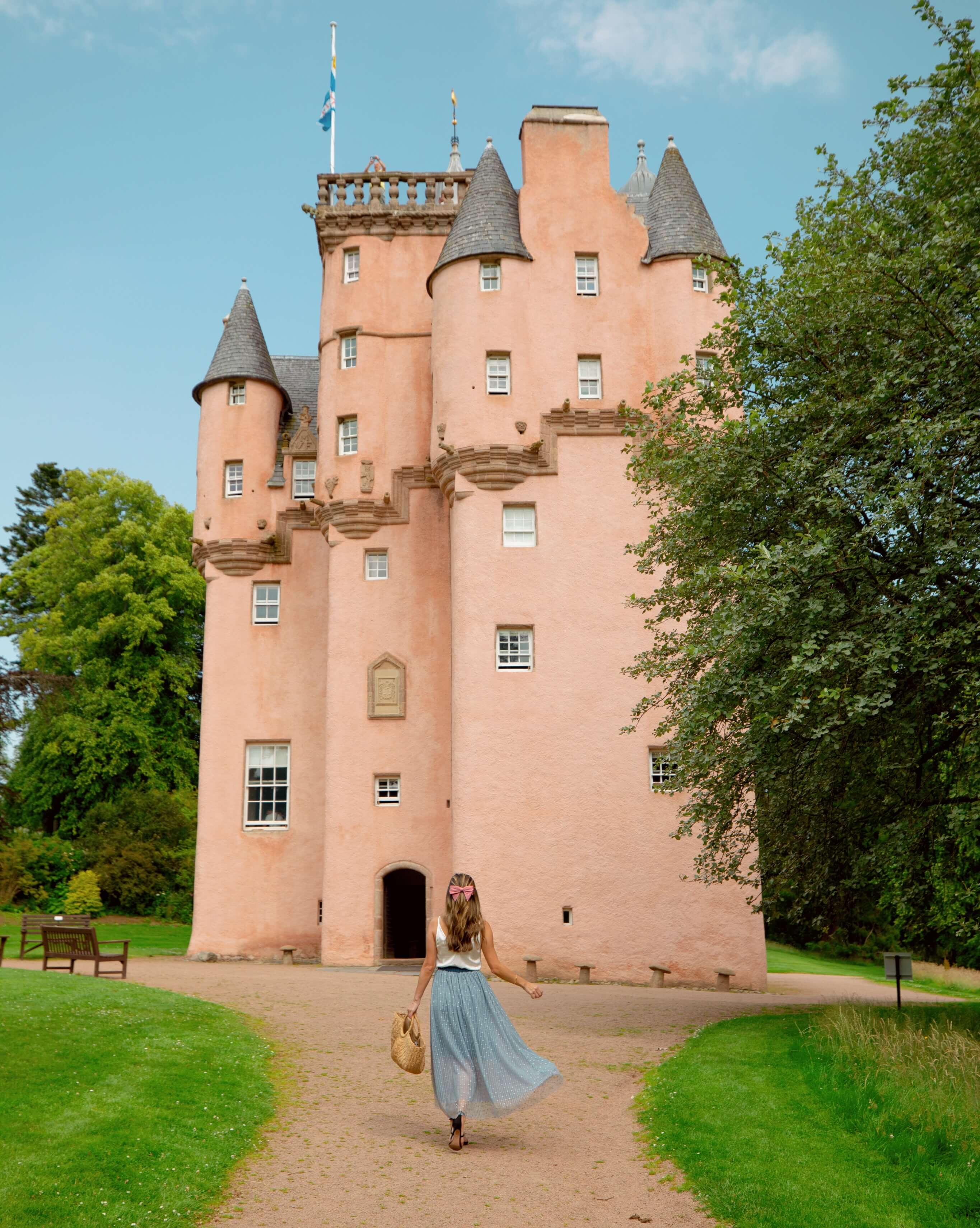
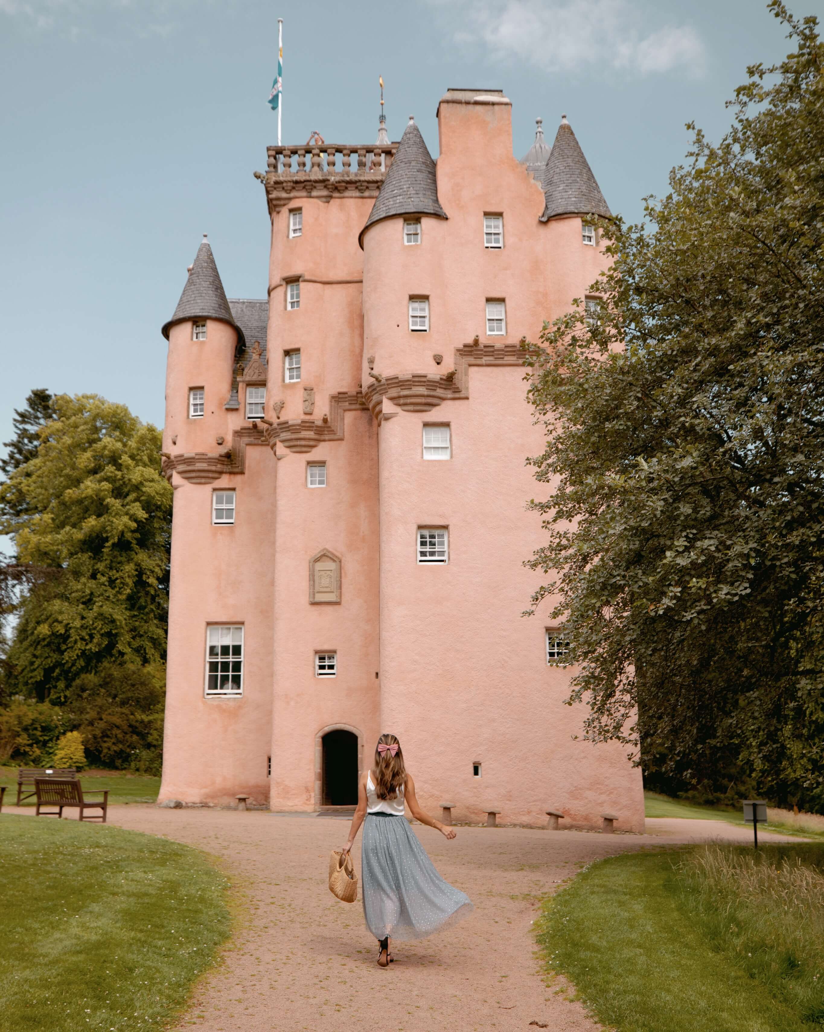
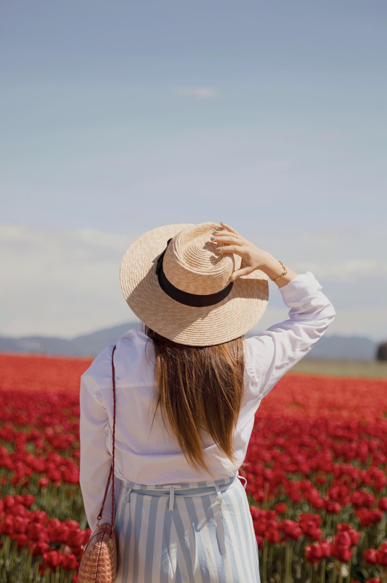
Speaking of your blog, how do you find your photo locations?

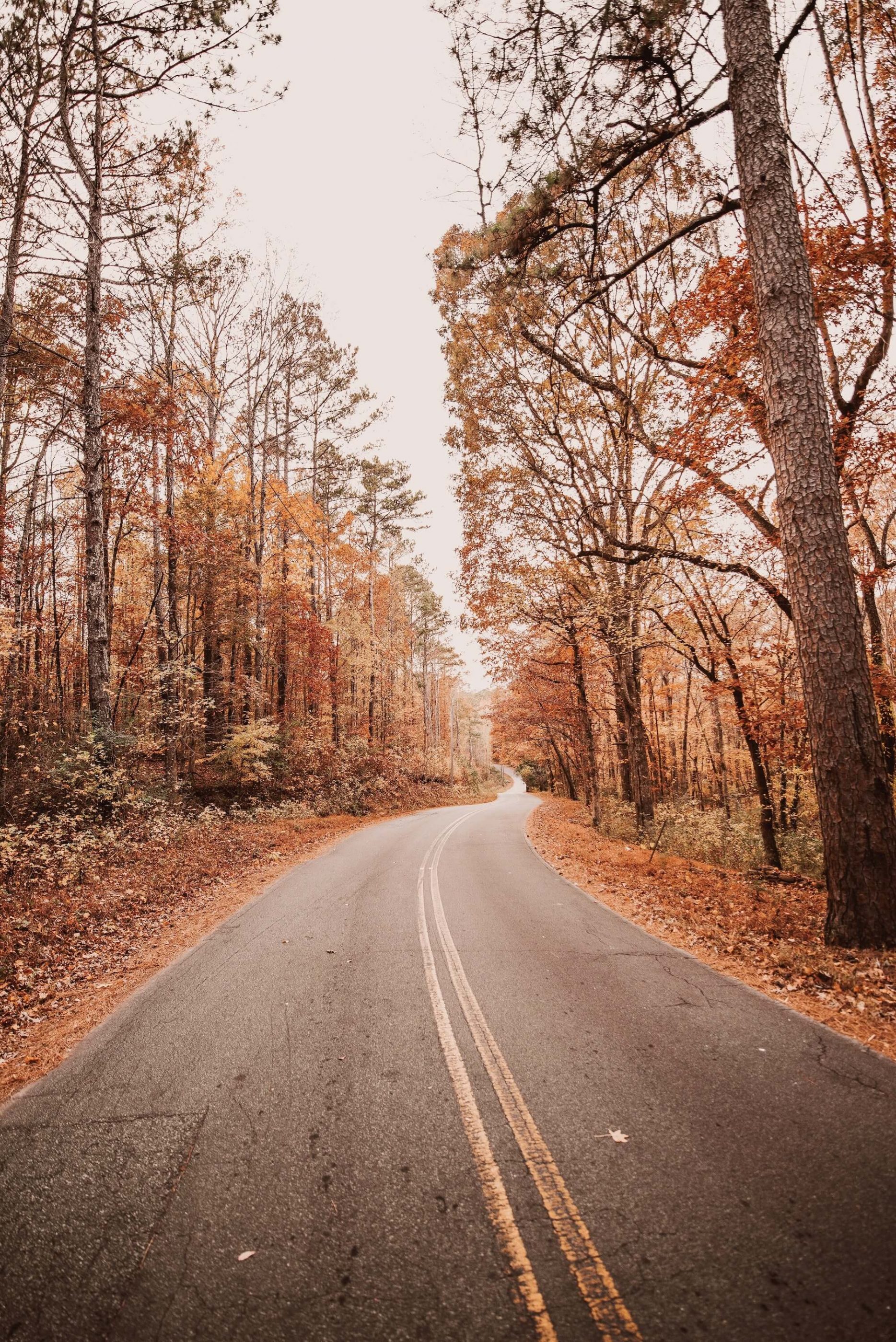
To be honest, it is a bit hard for me to find the kinds of locations I like given that I live in LA! I love anything that feels vintage or timeless, so I tend to shy away from anything that is too modern or colorful – it’s just not my style. So I look for older architecture, textures and tones, and places that feel like they could be from times gone by. I use Instagram to search for locations, as well as just driving around and adding locations to my maps on my phone. And since I moved recently, I’m hoping to make my new home my primary location for shoots.

What does a typical workday look like for you?

Because of the variety of my schedule, every day is different from the last — but there are some constants. I always start my day with emails, which consists of checking in on current projects and following up with new requests. I try to post on Instagram 1-2 times a day, so a lot of my time is spent editing photos and making sure I have a “bank” of images to choose from as well as scheduled posts for sponsored content. If I have events to attend, those are usually during the day, and if I have new images I’d like to shoot I typically do those around sunset or very early in the morning to have the best light. I make it a point to stop using my phone in the evening so I can be present, so it’s always my aim to be “done” by 6pm, but I’m not always the best at checking out!

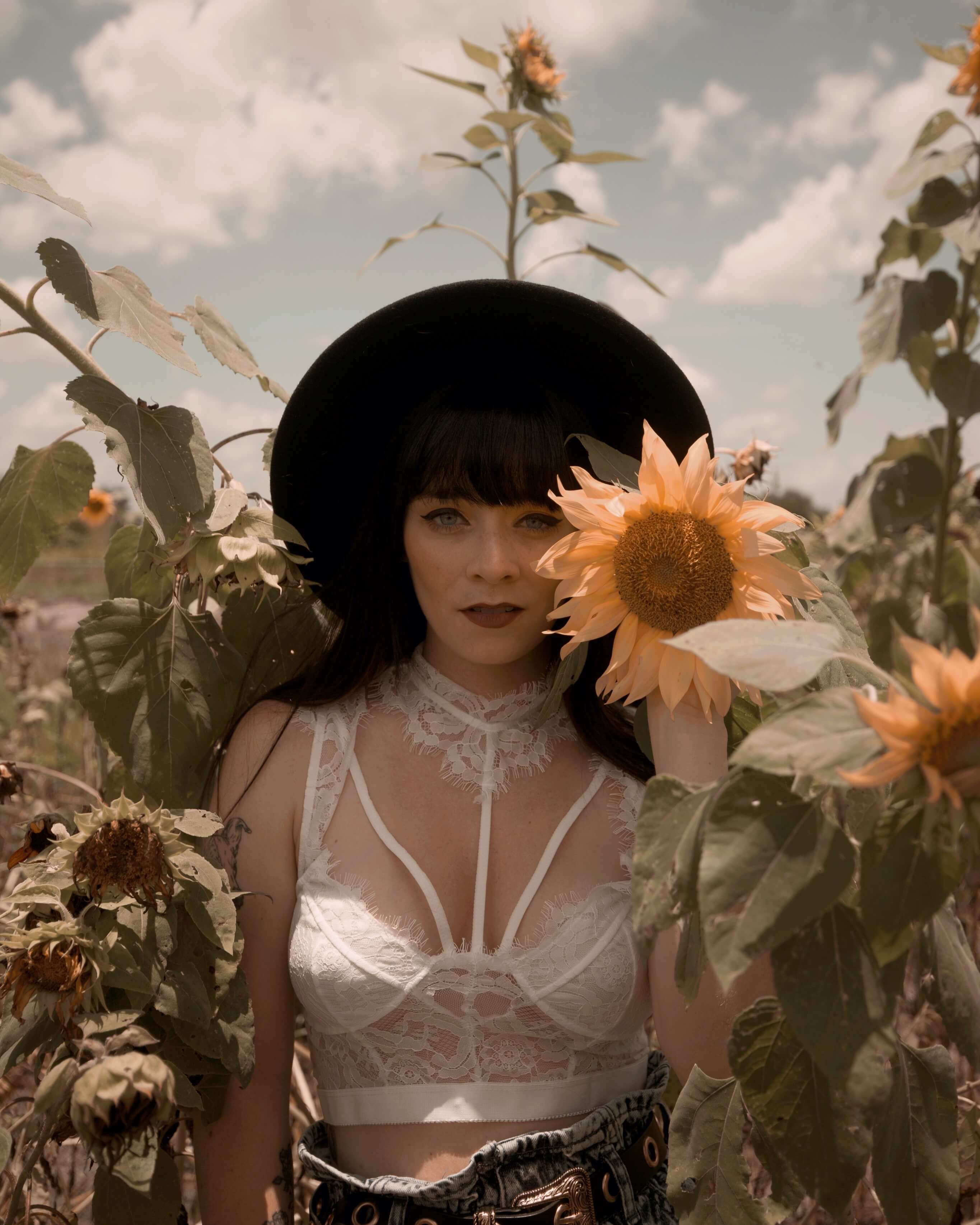
If you were limited to just one filter, which would you pick and why?

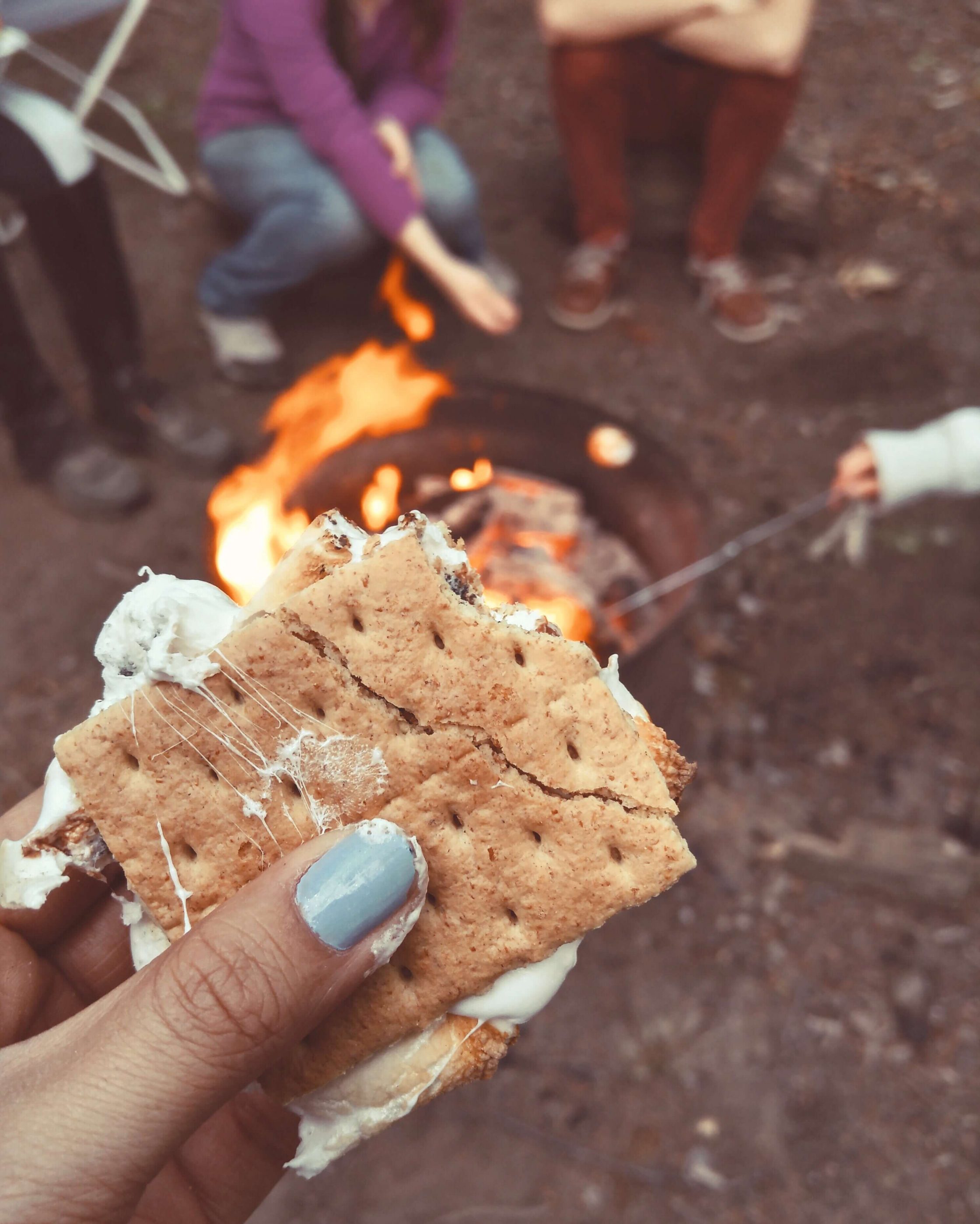
This is an easy one for me because it’s the filter I use on almost every single photo — Suede! I love that it combats green tones, and gives everything a warm and autumnal feel without being too cartoony. It’s my favorite!

After
Before

Thanks so much to Courtney for taking the time to let us in on her creative process! You can check out her favorite filter, Suede, in the A Color Story app. Love a good, warm edit this time of year!

How to Shoot Photos in Direct Sunlight

Photo Tips

4 Tricks to Shooting
Photos in Direct Sunlight

By Katie Day (@ohkatieday)

If there was a magic wand for sale that could make every photo-moment suddenly turn into golden hour, most of us would be all “umm…add to cart, please!”.

But sometimes you find yourself with the world’s DREAMIEST BACKGROUND and it is right smack dab in the middle of the day without a speck of shade in sight. Not even a tiny, baby cloud floating around that could help you diffuse that giant direct sun.

DON’T PANIC. Utilizing the mid-day sun can be really cool and give off high-end fashion shoot vibes. I will walk you through it, and you don’t even have to wait 2-business days for these tips to ship!

The Pros of Direct Sun

Bright, saturated colors
Bold, dynamic contrast
Adds jawline shadows and muscle shadows for flattering definition
Vibrant blue skies—see this A Color Story tutorial for more on that!

The Challenge of Direct Sun

How do you pose the subject so that their face is still flattered?
What if they are squinty?
What about harsh/unwanted shadows on the face?

Here are my four go-to approaches

To demonstrate this, I did a demo shoot with Ana in the middle of a sunny day, and we didn’t leave a 50 foot radius.

Harsh Shadows

Think of the sun as your spotlight. Think of it as your studio light that you brought in yourself and set up way high on a light-stand. Think of yourself as Mary Ellen Matthews, the SNL photographer who could set up studio lights ANY way she wants, and chooses high-contrast direct lighting. (She’s so cool. I love her.) The only difference between these two photos is I instructed her to “point her nose toward the sun.” The resulting shadows are much more flattering under the jawline. Oh and also. Sunglasses. We’ll get to that.

Shoot Wide

My favorite direct sun option is going wide! By stepping further back, I was able to create a dramatic, vibrant wide shot dripping with contrast and saturation. The sun is spotlighting her face evenly. No harsh under-eye shadows, but there is a sharp jawline shadow that flatters her.

Bounced Light

This is a great technique to bounce the direct sun with some backlight. Ana turned and faced the same white wall you just saw, using it as a giant reflector. Her skin is now evenly lit, her hair has some cool back lit halo and dimension. I’m into this lighting. She moved only 2 feet away from the first shot and the lighting is completely different.

Full Shade

If you don’t want to think too hard, find the nearest full shade, and go for it. You can’t mess this up.

Edge of Shade

Much more interesting than full shade in my opinion! You can create lens flare, backlighting and imitate golden hour vibes.

Here’s Ana showing us our shooting location for your reference. Direct sun, white wall. We found 4 very different looks in less than 4 minutes.

Now here are some examples from the wild.

After
Before

The problem: Their very favorite location in Spain, no shade, no time to come back later.
The solution: I had the subject face the sun and then I shot wide. Specifically, I instructed the subject to again “point their nose toward the sun.” Their eyes can stay on the ground, or in this photo I just told her to close them and soak in the moment in her favorite spot in Spain. No need to blind your subject! At no point do they ever need to actually stare into the sun. This spreads our “spotlight” evenly across her face. No harsh under-nose shadow, but it does create a sharp jawline shadow that actually does flatter the subject.

Choose an edit that accentuates the bold, vibrant high-contrast look like our Fashion filters.

After
Before
Utilize Backlighting

In this photo, the sun hits the subject from about 3/4 quarters behind. To block the sun further, I had Arin’s face provide shade for Cody’s face. Then in A Color Story, I chose Weekend, an edit that softens the harsh contrast and used the Highlights/Shadows sliders to fill-in highlights or lighten dark shadows making the look even softer.

Bonus ideas:

Embrace Weird Shadows

You can intentionally use the high contrast shadows that direct sun provides to double-down and JUST GO FOR IT like in this photo of Logan. This session was around 2pm, a typically bummer time to have to take someone’s portrait, but it ended up getting us creative with some nearby foliage. Limitations can actually trigger more creativity!

And don’t forget: Sunglasses are always cool. Sunglasses make everyone look cool. How else would we have known who the cool kids were in 1970s sitcoms? You wouldn’t, would you? And as always, a good, dramatic preset like our Mood pack can take an otherwise “meh” photo to a REALLY cool photo. Oh… and those you can actually “buy now with one click.” ?

Twilight

Filters/Effects

Twilight

Hi, friends! We’re so excited to share some tips & tricks about our newest filter +pack, Twilight. We partnered with fashion blogger, Rachel Iwanyszyn, of Jag Lever to create these moody filters, and we’re loving them so much already!!

First up, let’s take a look at each filter applied at 100% opacity.

BEFORE

MYTHS

Myths really subdues blues and greens while keeping skin tones in tact for a dramatic edit

ENCHANT

Enchant is a warm filter that focuses in on deep midtones

FABLE

A dramatic filter that turns blues and greens toward grey—just look at the sky here!!

WIZARDRY

Think of Wizardry as a sister filter to Fable, with a touch more blue

MOON LIGHT

A warm filter with a golden hour glow

CHARMER

Charmer is a brighter look that keeps colors in tact while adding a subtle mood

FULL MOON

Red and purple hues have a moment to shine with Full Moon!

HOWL

Howl has a warm emphasis that leans orange—we love using this one on landscape photos, too!

MYSTICAL

Red, green and blue tones are all here, infused with a bit of mood

ZODIAC

Zodiac is great for mimicking that sunset feel anytime of day

LUST

Shadows are brightened in Lust while highlights are dim, so the midtones are star of this show

DREAMS

Love this one!! Skies are grey and greens become a deep evergreen

LUMINOUS

Luminous brings out the warmth in your photos—we love how it transforms true whites to a rosier hue

LORE

Be on the lookout for deep shadows and intense blacks with Lore

So many of these filters feature desaturated or grey-greens while maintaining red, yellow or orange for a pop of color, and we love that! It manages to give the Twilight filter +pack a very distinct feel to be both moody and saturated at times.

The photo below was edited using Wizardry, and it completely transforms the vibe of the photo! Rachel looks like a total earth goddess here—this look definitely suits her. ?

After
Before

The next photo was edited with Zodiac. Love how the blacks retain a pure black, while the whites lean warm + soft. Such a beautiful, complex filter!

After
Before

Finally, we have Dreams, which is a great example of the color profiles in Twilight! The skies and buildings become grey, while the yellow shifts to a warmer hue and maintains its saturation. We also especially love how the reds here stay bright + poppy!

After
Before

We’d love to see how you’re using Twilight, too! You can tag us in your edits using #AColorStoryTwilight and #AColorStory. Thanks for reading, and if you haven’t already downloaded Twilight, you can find it here!

How to Get Perfect Fall Vibes in Your Photos, Every Time

Get the Look

how to get perfect fall vibes in your photos, every time

We’ve officially transitioned from “hot girl summer” to “cool girl fall”, and we’re SO excited for the weather to chill as we welcome the coming months.

This season is one of our favorites to capture—between the colors in nature and the cozy feelings autumn brings us, we’re always stopping to snap a photo. We’ve just released a filter +pack with Steffy, Harvest Moon, that focuses on the colors and feel of autumn. In this post, we’re going to share some photos edited with Harvest Moon and some of our other favorite filters that really show off what this season can do!

Keep Orange Saturated for a Color Pop

The photo above was edited with Haze from the North West filter +pack. We love how Haze keeps oranges really saturated while muting some of the other colors to really bring your focus to those cute lil pumpkins!

Shift Greens into a Yellow-Green

We love seeing green leaves subtly shift into yellow, and then brown, as this season progresses. This is easy to mimic on any photo where you want to amp up the fall tones! For the photo above, we used October from the Seasons +pack which gives greens a more yellow tone. This feel can be replicated using the Color+ tool if you select green and pull the hue slider toward yellow.

Play with Moody Edits

The photo above was edited with Cinnamon from Harvest Moon, which adds that instant fall mood! We love how the sky has shifted into a moody, dreamlike color.

Experiment With Shadow Play

This is the time of year where shadows become elongated as the days start to shorten. Our favorite fall photos play up what we find in nature, like this photo edited with the Summer filter +pack. The Vacation filter enhances the moodiness here!

Choose Warm Edits for a Cozy Vibe

This photo was edited with Garnet from the Golden filter +pack, which lightens and adds red hues to the shadows for a warm look. This edit feels cozy and nostalgic to us!

Try More Muted Highlights

The highlights of a photo are the brightest part—in this case, it’s the sky. You can play around with the highlights to make them brighter (more white) or dimmer (more grey). We love how muting the highlights in this photo gives it the feeling of a foggy day. We edited this one using Cedar from North West, which instantly gives photos warmth and that foggy feel.

Harvest Moon

Filters/Effects

HARVEST MOON

Happy fall! We’re toasting the season of cider and spice with a new filter +pack with Steffy! You may know Steffy from her interiors + lifestyle blog, Steffy’s Pros + Cons, or her pumpkin-hued Instagram, @steffy. We love the rich, warm look this filter +pack provides — it’s just perfect for autumn!

Let’s start by looking at each filter, applied at 100% opacity.

BEFOre

campfire

Warm and moody, this filter transforms yellows + greens to a warm rust.

flannel

Love how the oranges really POP with flannel!

pumpkin spice

Pumpkin spice brings shadows up and highlights down for a low-contrast look.

cozy cardigan

Cozy cardigan ups the reds in the midtones, and desaturates greens for an instant mood.

cider

Cider is a great base filter for any photo! Subtle but effective.

cinnamon

Cinnamon has a little more fade than some of the filters in this +pack, and we love it!

corn maze

Corn maze is saturated fun, with bright oranges and yellows.

falling leaves

Falling leaves is the moodiest filter of the bunch, and it really shows off the beautiful brown hues of the season!

acorn

Acorn is perfect for you if you love the look of Falling Leaves, but you’d rather a more subtle edit.

candy corn

Love how Candy Corn brings out the perfect amount of all the autumnal colors!

Which filter is your favorite?! There are so many good ones for all the memorable, photo-worthy parts of autumn. Here’s another look at Flannel. The transformation of the sky reminds us of a foggy, fall day!

After
Before

The photo below is edited with Cinnamon. This is a perfect filter for creating an overall warm, seasonal vibe! We love how the kelly green trees shift into a deep evergreen.

After
Before

This final photo is edited with Acorn. This filter desaturates the oranges and yellows while keeping skin tones intact and bright highlights. This filter is so diverse and can be used in many different settings!

After
Before

We hope you enjoyed this look at Harvest Moon, and would love to hear which filters are your favorite! The Harvest Moon filter +pack is available in the app now and FREE if you’re subscribed to ACS+! Once you’ve downloaded it, be sure to share your edits using #ACSHarvestMoon.

5 Ways to Use A Design Kit’s Collage Feature

A Design Kit

5 fun collages to make
using a design kit

Have you seen A Design Kit 2.0 yet? It’s our biggest update to the app — ever! We’re SO excited to introduce the new features, especially the new Collage section. We’ve been having so much fun playing around with all the vintage-inspired scans and cutouts, and we’d love to share a few ways you can use these tools, too. Ready? Here we go!

Make a Bouquet

The Botanical pack comes free with this update to A Design Kit, and we love all the creative ways you can utilize these romantic flowers in your collages. You can add them sparingly or go big like Emma did in this stunning design below!

Spell It Out

Adding fun letters to your designs is easy as ABC with ADK 2.0! Write digital love notes (or ransom letters) with this new feature. Aren’t they so cute on the photo below?

Less Is More…

Another way to use the new Collage feature is to pick one cutout to use — almost like a sticker — on a design! In the image below, we’re using just one of the cutouts to enhance our design and bring more focus to the message.

…Or More is More!

We’re also loving all the different combinations from the Collage section that can make really unique, one of a kind designs! In this image below, we’ve used collages from Botanical, Tape, Star, Cutout, Flora and Phrases. It’s fun to see how the photo we’ve created this with almost disappears into the background as the design takes shape.

Add a Frame

We’ve seen some users add a frame using A Color Story and then bring the image into A Design Kit to add collages on top! We think this is a really fun way to show off the many types of realistic-looking tape.

We hope you have so much fun playing around with these new tools in A Design Kit, and we’re excited to now offer all-access to the app with ADK+! We’re giving the option to subscribe monthly or annually, and ADK+ subscribers will immediately gain access to ALL the Collage items with a membership.

Be sure to update your app to see all the new features, and tag us in your creations using #adesignkit. We can’t wait to see what you make!

Jetsetter

Filters/Effects

Jetsetter

We’ve gotten a touch of wanderlust working on this new filter +pack with Christine Tran (AKA @tourdelust!) If you’ve followed Christine’s Instagram or blog, you know her distinct style of capturing beautiful places around the globe, and we’re so excited to bring these looks to life with this filter +pack!

Let’s take a look at the new filters, each applied at 100% opacity.

Before

marrakesh

Marrakesh is a warm + moody filter that sets the tone for the whole Jetsetter pack!

scotland

This filter is soft and airy, with lightened shadows and a focus on pink and purple hues

wanderer

The warmth in this filter creates the perfect sky blue, while subtle pinks become a rich salmon

cyprus

Love the mood in Cyrus! This filter adds a subtle warmth that’s great for portraits as well as travel photos.

parisian

While many filters in the Jetsetter pack lean warm, Parisian keeps a true blue mood with evergreen hues

turkey

Love the surreal sky Turkey provides! This filter manages to be subtle + dramatic all at once, just how we like it!

puerto rico

Puerto Rico is the most saturated of all the filters in the Jetsetter pack — you can really see it in that green, green grass!

santorini

If you like Marrakesh but want a little less warmth, Santorini is the go-to for you!

tulum

Warm + soothing! This filter looks how walking on a beach feels.

new york

New York is the most dramatic of all the filters in the Jetsetter pack, and we’re loving it applied to this photo!

city

City is another bold one! The shadows are more subtle in this filter compared to New York.

Salerno

A subtle yet effective filter for all your #travelgrams!

As you can see, many of the filters in the Jetsetter pack focus on soft + bright edits with emphasis on peach, coral and pink tones. We love the dreamy, romantic mood this creates! Here are a few before & afters using Christine’s photos from her travels.

After
Before

The above photo was edited with Puerto Rico — we love seeing how it brightens the midtones and adds a warmth to the whole photo!

After
Before

We adore the subtle shadows in Cyprus, which is what the above photo was edited with!

After
Before

Pinks and oranges pop in Wanderer, the filter used on the photo above! This filter has bright highlights, which is fun because it really highlights all colors present in the flower field. So beautiful!

The Jetsetter filter +pack is perfect for your next vacation or reliving your last one! It’s available now in the app, and we’d love to see your edits. Use the hashtag #AColorStoryJetsetter to show ’em off!

Summer

Filters/Effects

summer

What’s not to love about summer? The A Color Story team has dreamed up our first filter +pack since launch in celebration of the season. With this +pack, we’ve focused on both pushing and pulling tones — blues in particular — to give the bright and warm feeling we get from late July afternoons.

Here is a look at each filter, all at 100% opacity.

before

lemon

A bright and warm filter that shifts blues into the perfect summer tone!

Firefly

Firefly lifts the shadows in your photo to create an instant mood

Sunnies

A subtle filter with light shadows and limited contrast

zinnia

Zinnia is the most dramatic filter of the bunch! Blues border on lilac in this one

surf

Surf creates instant nostalgia for us as we view our summer memories through this subtle black & white filter

lime

Lime is a good sister filter to Firefly. Same vibe but a little more drama!

umbrella

Umbrella features crisp blues and a slight pink tint

suntan

Suntan stays pretty true to color and pushes shadows a little darker — like any good suntan does!

vacation

We love how this filter modifies the blues and pushes the warm tones just a bit!

saltwater

Saltwater brings out the grey tones in your photo and drops highlights for minimal contrast

We’ve had so much fun using these filters on everything, but especially our pool and beach photos! Here are a few examples of before & afters.

After
Before

This photo was edited with Firefly, and we LOVE how the blues become a deep teal color.

After
Before

We used Lemon to edit this drone shot, and it’s fun to see the brightness added to both blue and yellow. Lemon is a perfect one-filter edit since it works so hard on its own!

After
Before

Lime adds a little mood to any photo! We especially love how it subdues the sky.

This entire filter +pack was created with the intention to minimize contrast and push color, mirroring subtle shadows we find after a bright, full summer day. Get it today in the app, and once you’re ready to share your edits, be sure to tag them with #AColorStorySummer!

How to Choose a Color Palette for Your Design

A Design Kit

how to choose a color
palette for your design

By: Mara Dockery (maradawn)

You’re ready to design, but you’re not sure where to start when choosing colors. If you’re feeling intimidated by a blank screen, here are a few tips to find your color palette.

1

start with your color story

Although it’s easy to jump right in and create designs, start with the big picture. Colors can help communicate the story you want to tell. First, think about what your Instagram feed currently looks like and the vibe you ultimately want to give off. Choosing a color theme will make the decision process so much simpler when you begin each individual design.

For example, if the photos in your grid have a rich and vibrant feel, you may choose to focus on using accents of jewel tones like teal, cranberry, purple, etc. for your designs.

2

Find inspiration elsewhere

Look around to other sources, like nature, photography, books, etc. One of my favorite things to do is to look at saved Pinterest photos. Take notes on why you find color combinations in your favorite photos, etc. visually appealing. Experiment with those colors in your designs.

3

review the color wheel

Do you want to create a lot of contrast? Choose complementary colors, which are colors that are opposite from each other on the color wheel, like oranges and blues.

Do you want your designs to feel bright, young, and happy? Choose colors that are primary or secondary like yellow, blue, green, green, orange or purple.

Do you want your designs to feel more offbeat? Choose colors that are intermediate and less used like red-orange, blue-green, yellow-green, etc.

4

Use the color picker in the app

If you’re designing with a photo, using the Color Picker tool is an easy way to find color inspiration. Take your design and sample any color from the photo to match.

A Design Kit is now available to download for free in the App Store!

North West

Filters/Effects

north west

If you’re a follower of Bethany Marie (@bethanymarieco), you know she’s an incredible fashion blogger and photographer based in Seattle, and her filter +pack gives all the PNW vibes! North West boasts of balanced tones and delicate saturation, while highlighting warm colors and powerful blues. These filters are perfect for sunrise, sunset, and all hours in between. Let’s take a look!

Here is an example of each filter, all at 100% opacity.

Before

fresh

A bright filter that gives photos a vibrant warmth

cedar

A subtle filter that gives a hint of mood

timeless

A go-to black and white filter with deep shadows

haze

Haze features muted highlights

moss

Desaturated tones are the key to this lovely filter!

neutral

Neutral gives blues a beautiful grey tone

glacier

Bright highlights and baby blues are shown off with Glacier!

Evergreen

Instant mood! Evergreen gives a mossy look to blues and reds alike

wander

A romantic filter for red & pink tones

wild

Wild focuses on midtones and gives your image a subtle pop

star

One of our favorites! Gives photos the perfect hint of orange

polished

Similar to Wild, with a little less contrast. Best for recovering highlights!

cascade

Muted shadows and a hint of green show off here

mist

A subtle filter, great for skin tones and skies

minimal

Minimal gives photos a subtle highlight and muted blues

glisten

Glisten gives photos a vintage vibe with just the perfect hint of green!

olympic

A gorgeous filter, best for dramatic landscapes and skies

dusk

Use this filter at dusk — or anytime! — for moody blues and greens

spark

Spark is a crisp filter featuring the brightest highlights of the bunch!

charm

We’re charmed by the lilac hues that blues take on in this filter

After
Before

This photo was edited with Wander. The sky looks so dreamy!!

After
Before

This one was edited with Fresh — love how this filter creates such a warm vibe.

After
Before

This was edited with Glacier, and if you pull the slider you can see a vibrant saturation added to the photo! This filter really shines on outdoor + nature photos.

If you’re subscribed to ACS+, you can get this filter +pack for FREE in the app store. Once you’ve explored the filters, tag us in your edits using #AColorStoryNorthwest so we can see what you’re loving!