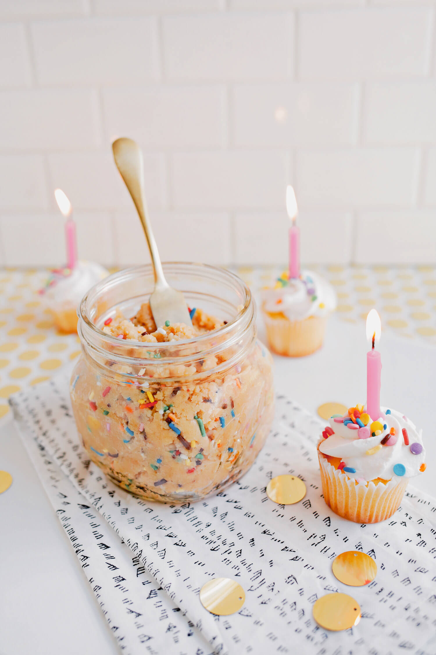
Introducing Cottage Core! Our new filters are inspired by the romantic quality of everyday life, and spending time both at home and in nature. Giving the often overlooked moments their own palette, this filter +pack focuses on bringing an overall softness to your edits.
First, let’s take a look at each filter, applied at 100% opacity.
No filter
willow
Brightens the image and gives greens a yellow tint
forage
This gives the edit a subtle brightness and warmth
daydream
A dramatic edit that desaturates yellows while giving warmth to other hues.
gingham
Bright, with saturated greens. This one is fun to use with nature photos
shady day
Looks like it sounds! This edit gives the image a depth with warm grey undertones
lyric
Very bright with saturated red hues. We recommend using this filter at 50% opacity if you’re in full sun.
dried roses
A dreamy low contrast, black and white edit
eyelet
Warm and bold, a modern sepia edit
wistful
Dark and dramatic, filmlike vibes
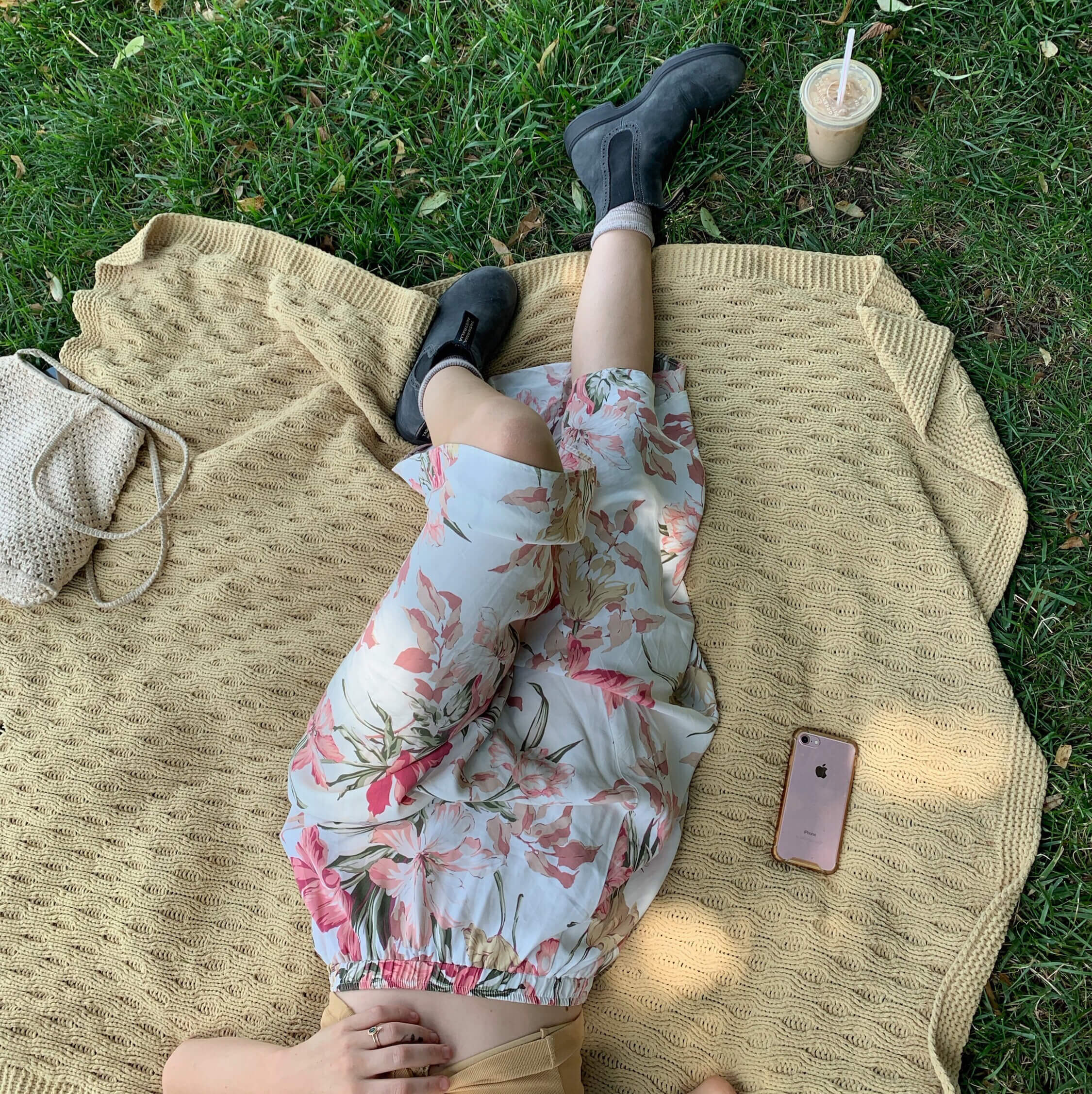
Now, let’s take a look at some before and afters!
After
Before
The above image was edited using Eyelet, and we love how it offers such a dreamy warmth. It gives us all the ’70s vibes on this photo in particular!
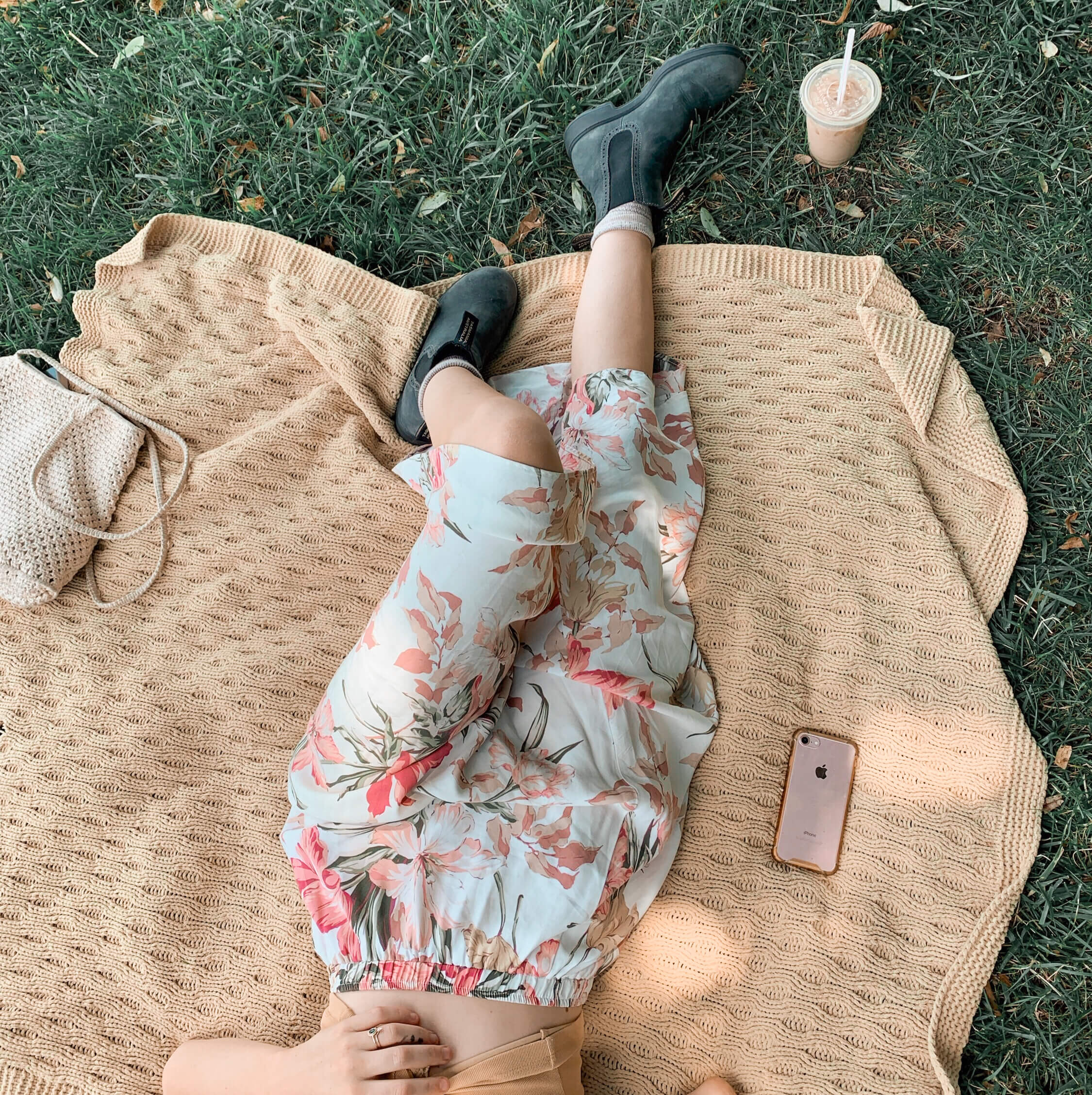
After
Before
This photo was edited using Wistful, and you can see how it deepens the photo instead of brightening it. You can, of course, add brightness too if you’d like! But we love how this filter enhances her skin tone.
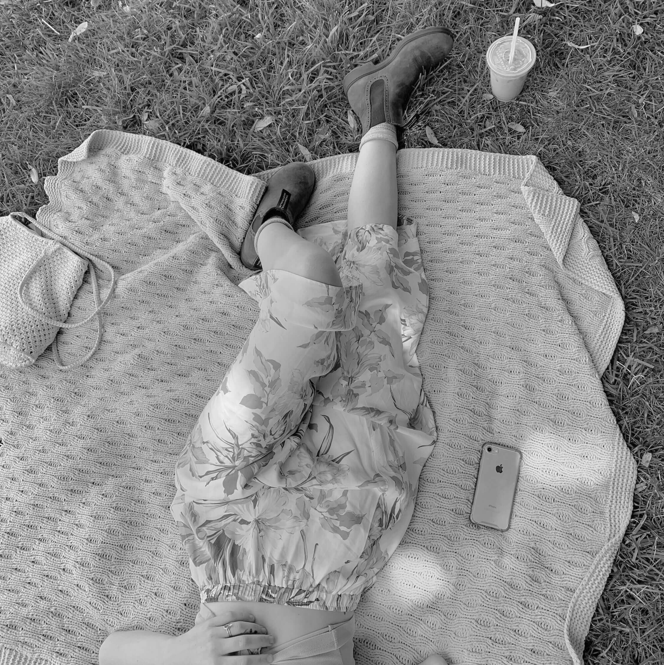
After
Before
One more fun one!! The Daydream filter really does something special to this photo, and we love it for a dramatic edit.
We have already loved seeing so many beautiful edits using the Cottage Core filters, and if you’d like to share yours with us, please feel free to hashtag your image using #ACSCottageCore. We’ll be reposting some of our favorites! xo!
We’re back with another Creator Spotlight, and this time, we had the honor of speaking with Teresa Freitas (AKA @teresacfreitas)! We love Teresa’s style, and we’d love for you to check out her A Color Story filter +pack called Palette! We’re excited for you to get to know her a little better through the following Q&A.
Please share a little about how you got into photography
Although my plan before and during fine arts college was to become a multimedia designer, I kept resorting to photography as the chosen medium to develop all my personal and yearly projects. Funny enough, even when this was happening, I didn’t accept that photography was going to or could be my future – but instead of focusing on other media and techniques that could benefit my initial plan, I couldn’t resist photographing, and kept going back to it at each opportunity. In my 3rd year of college, I installed Instagram. Instagram allowed me to explore photography in an informal and experimental way that didn’t have the artistic pressure and seriousness I was getting from college. I was shooting with my phone on a daily basis, without giving it any special thought. Eventually, I got attracted to the world of editing and colour, and how it could quickly shape our perception of an image. I ended up being noticed by brands for my compositions and colour-work in still life scenes, and about 3 years ago I realised I could be a full-time photographer. Content creation for brands helps me support my – at last accepted – passion for photography.
We are obsessed with your bright, candy-colored editing style. It’s so unique! How did you decide to go in that direction, and how long did it take to develop your style?
Thank you! It wasn’t a conscious decision from one moment to the next. My taste was guiding me along the way as I experimented with different approaches to colour. I went through different editing stages, but eventually found myself in amidst of pastel and softer tones, but wasn’t quite satisfied. From that point, I knew I wanted to develop a style that would have pastels as the starting-point, but with a twist, something different in colourization. It took me around 2 years to finally reach a point where I’m happy with my colour-palette, although it’s still an ongoing process. I like to edit each of my images from scratch in Lightroom and understand what each picture needs to be able to recognize myself in it. Sometimes it doesn’t happen on my first try, and I often only go back to an image after some I’ve spent some time apart from it.
What are your biggest artistic influences?
It’s curious to think that, when I was developing my work and creative identity (which is ever-evolving), I wasn’t recalling specific references to work on top of and create something new from. At least in my case, I was only able to pin-point my references after I developed a style I could immediately relate to. I guess, because I went through so many inspirations and influences when I was taking Painting and Multimedia Art, it was hard to understand which artists influenced me, and which ones inspired me. Inspiration is endless, and happens daily, but influences stay forever, and can be traced to the timeline of your evolution as an artist. In painting, I think of painting masters like Van Gogh, Matisse and Magritte and their own approach to colour. In photography, I like to recall Fan Ho’s colour photographs, William Eggleston visual diaries and Nguan, more recently. In Cinematography, animation movies played a big part in my development of visual taste when I was growing up. I like art that is beautiful, that provides a moment of visual pleasure, without expecting to receive more from it. That’s something my references gave me, and what I want to convey in my own images too.
How have you adapted during isolation? Any tips on staying creative in uncertain times?
Not travelling (and not leaving my house) has been hard, since I can’t go out and shoot. My first tip is to try not being too hard on ourselves and giving into the pressure we feel that we need to create. I’ve been going through the archives of past travels and re-discovering places and images I disregarded before. Because I like to shoot in natural light, outside, winter is a slower season for me in terms of creating still-life shots. I’ve dedicated this time to a new project, one that I hope that will transform my audience on Instagram into a community of those who follow me more closely. I’ve been reading more, and taking online courses. I’m trying to not let this time feel like it went “to waste”, and exploring other creative outlets that can eventually contribute to my work.
If you had to choose one of your filters you’ve created with A Color Story, which would you choose and why?
For a favorite filter in the app, I’d pick Razzle Dazzle from my Palette pack. It’s great for a color punch. It takes me to the peaceful flower fields in Alentejo during spring, with pops of red and orange. It’s my favourite place to go back every year. Because of COVID-19, I wasn’t able to go last year and I’m missing it terribly. I’m hoping lockdown ends before May in Lisbon where I live, and I can escape for a few days to restore the feel-good sensation that scenario gives me. See Razzle Dazzle in action below.
After
Before
Thanks again to Teresa for taking the time to open up about her artistic process! You can find more from Teresa by exploring her A Color Story filter pack.
We’re loving jewel tones this season, and our newest filter +pack celebrates them! Jewel contains 11 brand new filters designed by the A Color Story team, and we’re so excited to show you some edits transformed with the magic that is Jewel.
First, let’s take a look at one photo edited using each filter in Jewel.
no filter
24 karat
An overall bright, warm boost brings out beautiful tones. A go-to filter!
icy topaz
This filter gives a cool boost, and we love seeing how it transforms this eucalyptus.
opalite
Who says jewel tones can’t be desaturated?! Opalite gives a dreamy, desaturated edit.
cabochon
This edit is a little darker and contrast-heavy to bring out the mood.
lapis
Try this filter on an edit with lots of blue to see the biggest impact.
druzy
A soft, warm edit we’re loving.
red jasper
Red Jasper brings up the shadows and pops the red hues.
dazzling
This edit boosts orange hues, as you can see from the backdrop.
emerald
Emerald adds texture and dimension, and boosts green hues.
yellow gold
Another bright + warm look we’re loving!
sapphire
Sapphire boosts violet hues as well as gives a cool edit.
Let’s take a look at a few before + afters, too, so we can see how the filters look in different settings!
After
Before
The photo above was edited with Lapis. You can see how much depth there is to the “After”, and we love how dramatically those green plants glow up.
After
Before
This one was edited using Red Jasper. True to its name, you can see how the After pulls out a lot more warm + red hues from the image! It also lightens and lifts the edit overall, which we always love.
After
Before
Saving the best for last?? Maybe. This one was edited using Druzy, and filter is a complete one-tap transformation of this photo! The edit pulls out so much from a photo that a nearly all one color, so you know you have to try the Druzy filter on your own images to see what all it can do. 🙂
Thanks for letting us share about Jewel! As always, ACS+ users will get this pack for free, and we’re already so excited to see the photos you’ve shared using the new filters. Be sure to tag us using #AColorStoryJewel, and we’ll share some favorites! xo.
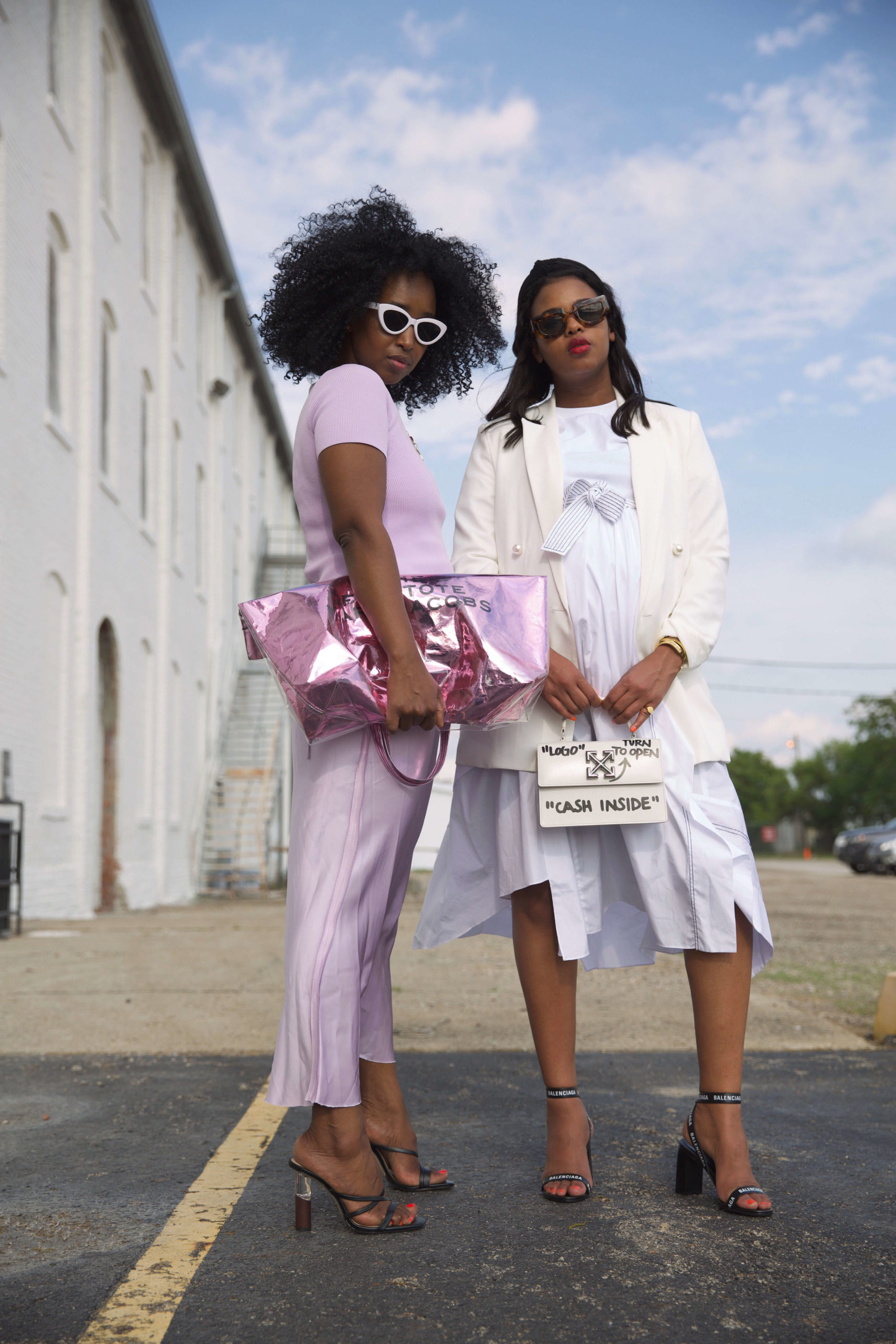
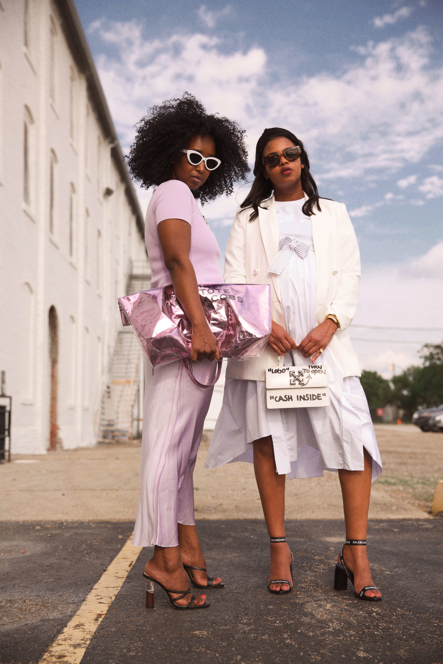
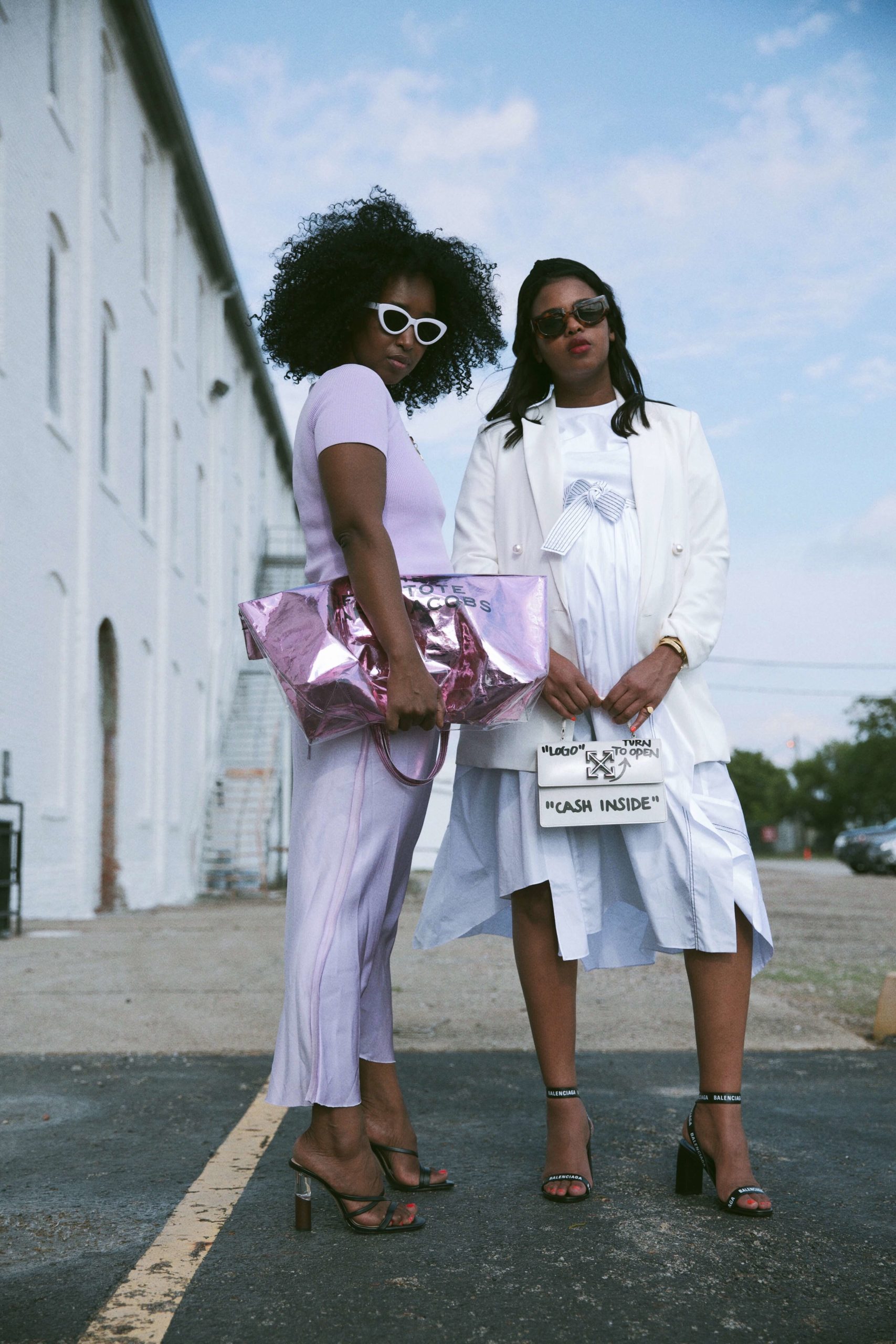
Sharing our outfits on Instagram is 2020’s runway show, and we partnered with sisters Nasteha and Nuni Yusuf (AKA the Yusuf’s) to create the most perfect, fashion-forward filters we needed! Nasteha and Nuni are a huge inspiration to us — they are they are bloggers, YouTubers, and entrepreneurs, as well as being sisters, mothers, and refugees. Top that all off with an incredible sense of style, and you’ve got The Yusuf’s.
Let’s take a look at all of the new filters available in Nas and Nuni’s +pack!
no filter
nas
A warm filter with subtle saturation
Nuni
Nuni is a darker, edgier filter with grey/blue tones present
Street style
Warm, deep shadows, and bold
luxe
Luxe brings an overall warmth and enhances gold + yellow tones
a vision
This filter brings depth while retaining the present colors
strut
Bright with pink hues leaning toward coral and enhanced highlights
Fashion week
Look at the sky in this edit! Fashion Week enhances blue + pink hues for a bright edit
Faded denim
You *must* try this filter on denim, because it 100% will give any pair of jeans an on-trend fade
LBD
Love a little black + white filter! This one is a classic
runway
Street style inspired, with a darkened ground and bright highlights to mimic flash photography
en vogue
We love this muted filter, inspired by polaroid tones
glamour
Black + white with juuuust a hint of green tones to mimic that vintage look
sartorial
Clean + crisp with bright whites and a healthy contrast
couture
This filter enhances neutral tones well, with added sharpness to show off texture
designer
Bright with undertones leaning toward green + yellow
a lewk
The most dramatic filter of the bunch, A Lewk enhances gold tones in a really fun way
iconic
The way this filter enhances red hues is — well, iconic!
mood
Soft, coral tones and the perfect blue are present in this filter
fire
Bold hues with a pumpkin spice feel
clutch
Light, airy, and bright blue!
Now let’s look at a few photos edited with the pack! Each filter is applied at 100% opacity.
After
Before
The above image was edited with the “Iconic” filter, and you can see how it adds the perfect amount of “oomph” to the red hues. Very ’70s glam feeling!
After
Before
Here, you can see how the “A Lewk” filter completely transforms the mood of this image. We love a one-tap edit that goes a long way!
After
Before
Finally, we can’t get enough of this transformation, edited with the Nas filter. The hues become so rich and beautiful, perfectly complimenting Nas’s personal beauty.
We hope you enjoy using the Fashion filters, and we’d love to see your edits using them! You can share them with us on Instagram using the hashtag #AColorStoryFashion. xo!
Hi, friends! We are so excited to share more about ACS co-founder Emma Chapman’s new filter +pack, Dessert. As you may know from her posts on A Beautiful Mess, Emma is passionate about baking and cooking delicious meals. So of course, Emma’s filters for food photography have been carefully created to bring out the best in your images! Let’s take a look.
Below is each filter applied at 100% opacity.
before
angel food
Adding contrast and dark shadows
rhubarb
Brightens the photo with clean, crisp midtones
sprinkles
A warm, pink filter with soft highlights
crumb top
A bright edit with strong highlights. A good filter for just about anything!
rose water
Whites lean more cream in this edit with soft shadows and good contrast
berry pie
Midtones lean green for a fun, vintage look
raspberry jam
A bright edit with violet undertones
hot chocolate
Adds brightness and saturated greens
jubilee
Turns whites into a pinkish hue, we also love this filter on portraits!
affogato
Shadows are dark here, almost black, and blues lean toward teal
buttercream
Dark shadows with violet undertones
Let’s take a look at a few before and afters!
After
Before
The above photo is edited with Sprinkles, and I just love how it changes the whole mood of the image! Sweet + warm. 🙂
After
Before
This photo of Emma was edited with Rose Water, and it’s a game-changer! This filter is definitely great for a one-tap edit when you’re wanting something simple.
After
Before
And the above photo was edited with Affogato! Love how it gives a subtle but impactful blue tint to the image.
Thanks for letting us share about the new Dessert filters! Remember, our ACS+ subscribers will get this (and every +pack) for free with your membership. xo!
We loved working with Julia Marcum of Chris Loves Julia on our “Interior” filter +pack, and catching up with her recently was an absolute joy! Here’s an excerpt from our Q&A:
Share a little about your life and what a typical day looks like for you.
We’re busy! Chris and I spend every day working to make our house more beautiful, while producing engaging content to take our audience along for the ride. We work with sponsorship partners and contractors and our team — and some days, we’re rolling up our sleeves for an inspiring DIY. It’s a good day if it ends hanging out around the fire pit with our girls or piling onto the couch as a family.
What’s one piece of advice you have for making
home a safe, creative space?
Go with your gut. If you have an idea for your house that you can’t stop thinking about — do it. Maybe you just love it, or you might just need to get it out of your system. In our first house, I painted our living room purple! Me! Purple! I painted Greta’s room lime green. I painted our living room blue! I left no color un-turned, and I tried it all. Now I’m much more reserved in my palette, but I never wonder. If the color itch strikes again, I’m not afraid to go for it. It’s just paint. Tastes change – thank goodness!
I get a lot of messages telling me I’ve changed over the years, and I take every one as a compliment. We’re supposed to change. We’re supposed to improve. We’re supposed to evolve. So it’s really natural to grow out of that wall color or candle color or textile or your decor in general. Making sure those pieces go to a home that will love it will make everyone a lot happier than disliking that patterned chair every time you see it.
What’s one life lesson you’ve learned from your career?
Don’t wait. Don’t wait until you have the house of your dreams of the budget of your dreams to start improving where you live. It’s so easy to say “We’re moving in a year, I’m not doing anything.” But a year is a LONG time to not love where you live. Invest in things you can take with you (like art for the walls, furnishings!) and start now! Creativity is a muscle. The more involved you are in improving your home, the more comfortable and confident you will be in doing so. When I was in a graphic design class in art school, I had to make 50 logos a day. At first it was so hard. But when I got in the groove, I found I could even go beyond 50! If you’re wanting to be creative in your DIY endeavors in your home, start and don’t stop – the ideas will start flowing.
Share one tip for styling a vignette to photograph at home.
Shop your house and remix your favorite pieces, so that home is always a place to show off your personality and style. When you focus on whole rooms and huge projects, it’s easy to get overwhelmed and discouraged. Take back the control! Spend 15 minutes in one corner. Make it reflect YOU. It’s good for the soul.
If you were limited to just one filter, which would you pick and why?
I love “Powder Room” because it’s so subtle, and
I layer on “Guest” afterward, and it adds JUST the right about of warmth.
Layering filters is my new favorite filter!
After
Before
Thank you so much for reading, and thanks a million to Julia for taking the time to chat with us! If you’re interested in learning more about layering filters like she mentioned, you can find a tutorial on that here.
And don’t forget, you can find Julia’s filter +pack, Interior, in the app! xo.
Keiko Lynn is one of our earliest collaborators with her filter +pack, Stardust, and we continue to be obsessed with her!! Recently, we caught up with Keiko for a little check-in and talked creativity and life during quarantine.
Share a little about your life and what a typical day looks like for you.
I’m not a morning person, so I usually take my time with my coffee and watch an old movie or listen to a podcast. I do most of my photography during the day, all of my writing and editing at night, and always end with a book.
What colors and styles are you most drawn to?
I go through phases. Lately, I’ve been into more muted tones, pastels, and anything with a dreamier quality.
In regards to fashion, I love a statement vintage piece. Not everything in my closet is practical, but that’s what makes it fun.
What tips do you have for staying creative during challenging times?
Lately, I’ve been spending a lot of time staying home and making masks. I bought a large spool of shoelaces when there was a huge elastic and bias tape shortage, and now I’ve been styling them in my hair!
I often look to the past and think, “how can I tweak this to suit me?” Even if it’s just a little wink and a nod once the product is finished, it’s a great place to start.
What’s one of your earliest memories of creating something you’re proud of?
When I was a kid, I decorated my pony’s stall for Christmas every year. I took it so seriously!
If you were limited to just one filter, which would you pick and why?
Right now, I’d go with Shrimpton. The blush tones work really well with my vintage decor.
Below is a before & after edited with Keiko’s favorite filter, Shrimpton. We love how drastically it changes the mood of this image!
After
Before
Thanks so much to Keiko for taking the time to talk with us. You can find her on Instagram, and you can grab her filter +pack, Stardust, in the A Color Story app for iOS and Android. xo!
It’s Disco time!! We’re here to talk about our newest effect +pack, and we’re so excited to show you all 15 of them. Each of these effects celebrate light in its own way—bright, sparkly, multi-hued, and magical.
Let’s get to it!
no effect
disco kiss
A light touch of disco squares all over the image
sparkle
This is one of the most subtle, and diverse, effects from this +pack! Love seeing it on all types of photos
slide
A stronger light beam that is more sparse across the image
light beam
We love seeing this effect in kitchens and bedrooms, where a disco ball would catch that lovely morning light
farah
Use this amber glow on an image with yellow & orange for it to blend in, or let it stand out on a photo with white!
dance
“Dance” is almost a combination of a flare and a glittered effect, and it’s one of our favorites from this +pack!
glitter bug
Loving this one. You can apply it more than once for greater intensity if you want additional glam
stevie
“Stevie” has a burst of light on the edge that spreads into a glimmer. Change up where you move it on the image based on your light source
glam
Add some glam with these bright diamonds! This effect would be particularly beautiful on images of water
galaxy
This effect features sprinkles of light with a pastel hue. Love its overall charm!
Confetti pop
Confetti Pop looks just what it sounds like, and we love using it on photos with minimal composition
gold confetti
Another confetti moment! This one shows up great on darker images, as well, for a nighttime party vibe
lilac glow
Subtle and sweet! These violet specs add a fun texture to your photos
kinetic
Kinetic is another subtle effect that will blend in more on brighter images, and show up more if your image is darker
Twinkle
Little stars! Use this one on its own, or double up for a more intense look
You can see the Disco +pack has a huge range of effect styles, while they all focus on that glowy look. We’re capturing some seriously magical moments with these!
After
Before
See Sparkle in action on the photo above! It’s so fun how this effect adds *just* the right amount of shine to any image. It definitely changes the vibe of the photo!
After
Before
Here’s an example of using Farah on a photo that already has similar tones—we love seeing how effortlessly it blends in to this cocktail hour.
After
Before
Finally, we wanted to show you Slide on this image. It blends in so seamlessly, if we didn’t know better, we’d say that was a natural light reflection on her hair!! This is a great +pack to use for any photo that needs that special touch, and we hope you love it!
Use #AColorStoryDisco to share your edits with us, and we can’t wait to share some of our favorites. Sparkle away!
Up your design game by using a color story with a design kit
Have you ever been working on a design that just felt a little — well, flat? Sometimes we get in a design rut and need a new creative exercise. That’s what brings us to A Color Story! Recently, we’ve updated both A Design Kit and A Color Story to include buttons to jump between apps mid-edit.
Here, we’re giving 5 ideas for how to level up what you’ve created in A Design Kit by adding the finishing touches in A Color Story.
1
Add a filter to your design
After
Before
Many filters in A Color Story alter the colors and saturation of your design, but some add a little something special, like the one above! The filter, Icing, from the Cake +pack gives this design a lilac hue and a little sparkle. So fun!
2
Play with the curves tool
After
Before
This idea is a little about surrendering to the creative process! If you’ve never played with the Curves tool before, using it on a design is a really fun way to see how it works. Keeping the shadows on this design as dark as possible added a cool outline to the text, and as you can see, the text shifted from red to blue.
3
Apply an effect for a fun look
After
Before
This is one of our favorite ways to use A Design Kit and A Color Story together! Here, we created the design, and then brought it into A Color Story to add Geode and Wave Length from the Prism filter +pack. It takes the message in the design to a whole new level!
4
try the chromatic tool for an edgy design
After
Before
The Chromatic tool in A Color Story splits the red, green, and blue tones found in your image — and it is more dramatic around the edges of the frame. You can see above how the words blur in the “after”, which completely alters the feel of your design! The color split will be more intense and noticeable with primary colors, or more subtle with pastels, as shown above.
5
Add some grain to finish the look
After
Before
One of the simplest, yet most effective ways, to add a little “oomph” to your design is by applying grain. This can be done using the grain tool in A Color Story, or by adding an effect that has grain. For this one, we applied the Rigby effect from the Dust +pack to get the look!
We hope this has been helpful to get your wheels spinnin’ for new ways to use A Design Kit and A Color Story together. We’d love to hear of any ideas you have, as well! Feel free to reach out to us any time, and share your edits using #acolorstory and #adesign kit. xo!
Have you ever taken photos on film?? We love the unique challenge of getting just *one* shot to capture a memory, and the colors we find in film are truly incredible. This was the inspiration for our newest filter +pack, Analog!
Each filter in Analog is inspired by some of our favorite film stocks, and we’re thrilled to bring these tones to the app. Here’s a look at each filter, applied at 100% opacity.
no filter
pro 400
Brightens, adds a little grain and a vintage look. Our go-to filter from this +pack!
Portrait 800
We are completely obsessed with how this filter affects blues. So rich and bright!
gold 400
Gold 400 adds incredible brightness and warmth
ultra 400
Ultra 400 adds a bold, desaturated look with muted blues
plus 160
This one features dark shadows and a slight desaturated look!
extra 200
Shadows are dark on this filter, with a green tint to it
superior 400
Moody, cool and contrast-heavy!
negative 400
Love this subtle black and white filter with low contrast
cinematic 800
A fun filter with dreamy blue tones!
quick disposable
A slight warmth and a vintage look, just like a disposable camera
flash disposable
This filter has a dreamlike quality and a little blur, just like this type of disposable!
daylight disposable
A warm filter that adds a touch of orange
B&W disposable
A great black & white for capturing landscapes and still life
instant film
True to the instant film you know and love!!
purple chroma 400
We love the unique quality of this filter’s hues
There are so many great filters included in this pack! Let’s take a look at a few before & afters.
The photo below was edited with Portrait 800, and it is D-R-E-A-M-Y! This is a great, everyday filter for adding the colors and saturation of film to your photos.
After
Before
Next up, Gold 400. See how the greens transform from “blah” to “woah”! This filter really adds the perfect punch to mobile photos.
After
Before
Finally, we want to show you Purple Chroma on one of our favorite photos! This filter is truly one-of-a-kind, and it has the power to transform the whole mood of the image. You can see how different this one feels in the before vs. the after!
After
Before
We’re so excited to get our film-inspired +pack, Analog, into your hands. Let us know what filters from this +pack are your favorite, and use the hashtag #AColorStoryAnalog to be featured! xo!
This website uses cookies to improve your experience. We'll assume you're ok with this, but you can opt-out if you wish.AcceptRead More