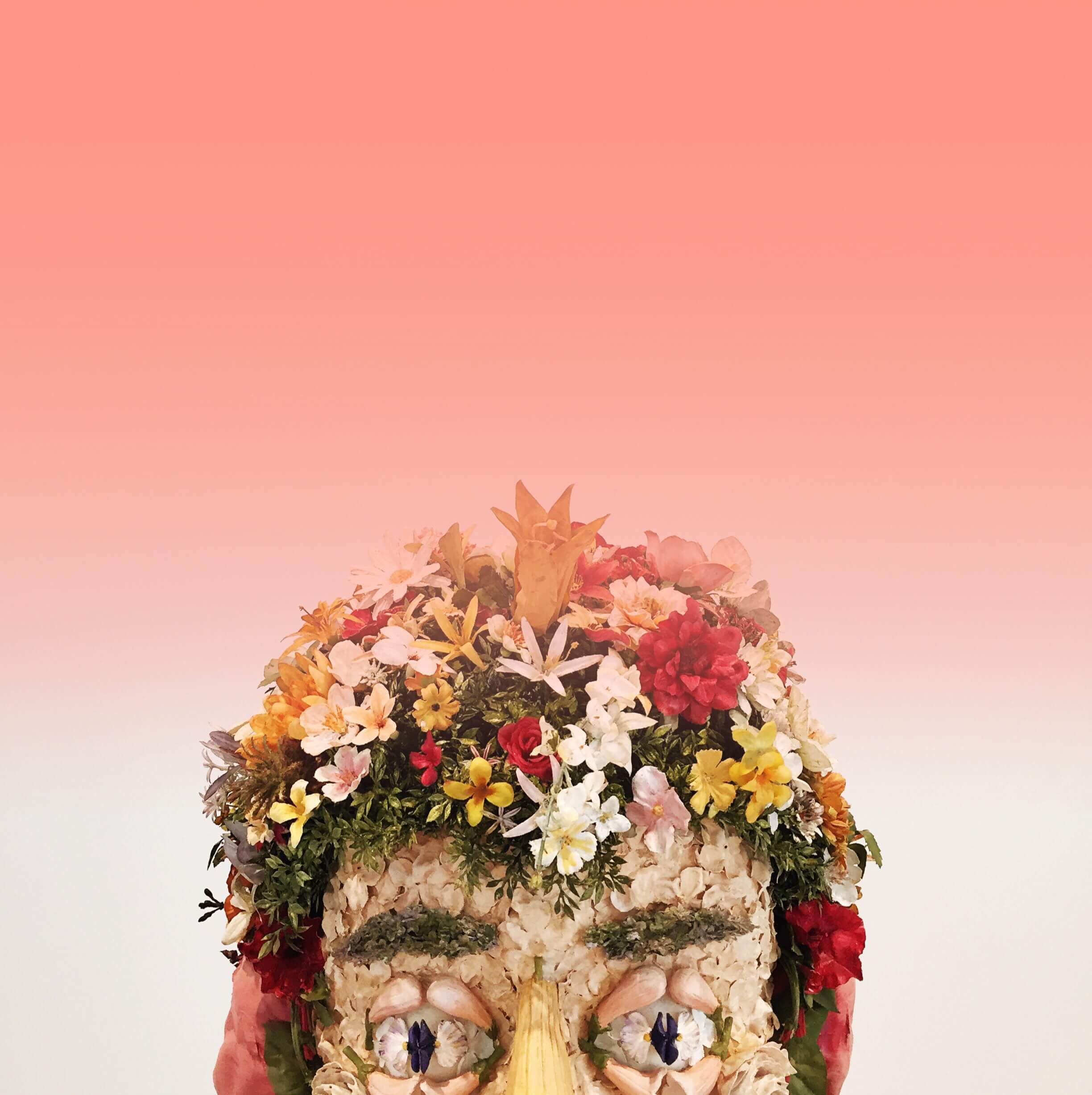
This look is inspired by Arielle Vey’s Instagram feed. Her grid pushes cool and warm tones while deepening the contrast to create an effortless beachy look. She’s also the creator of our filter +pack, Weekend, available on iOS and Android.
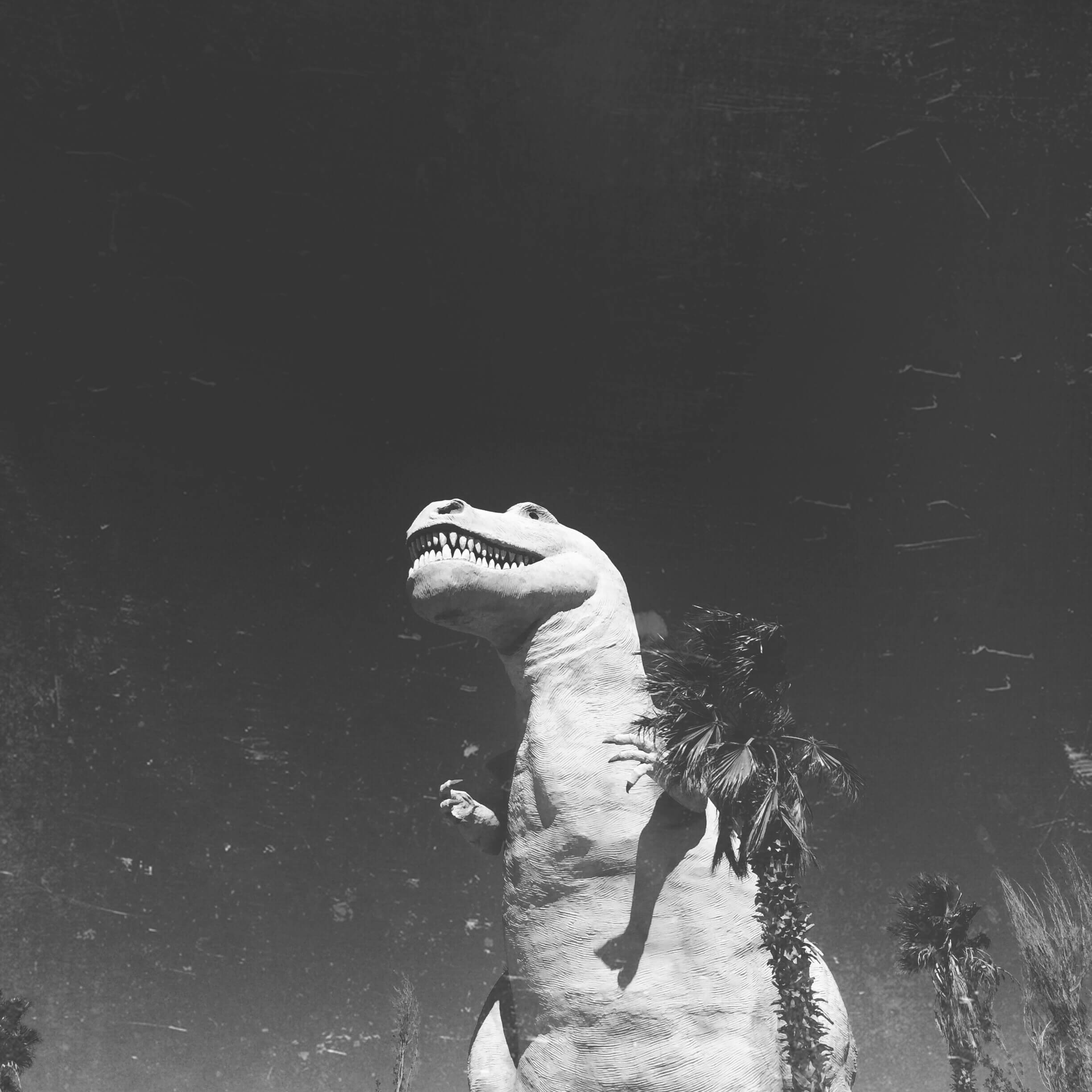
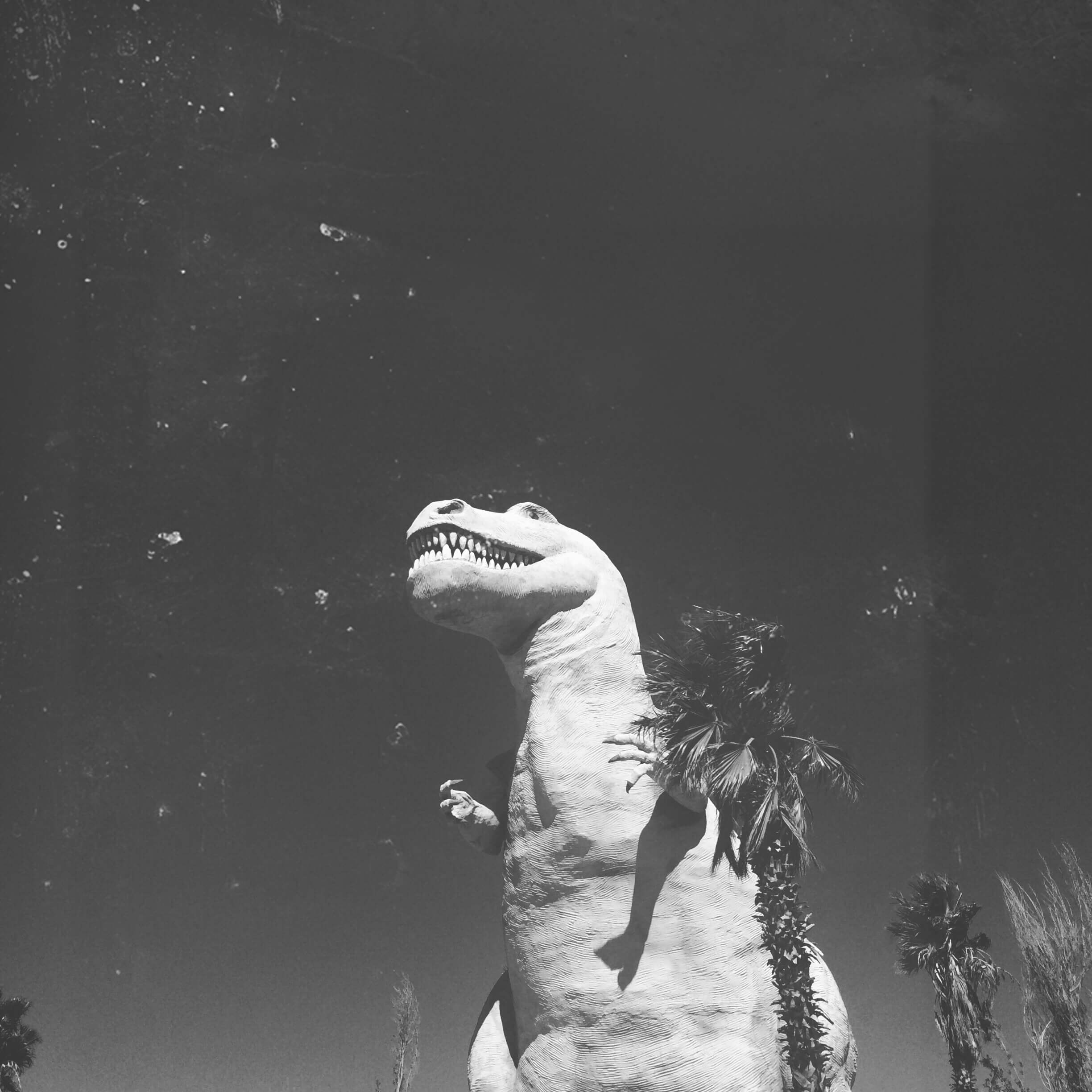
This look is inspired by Elsie Larson’s Instagram feed. Stacking these filters creates a 70’s inspired and warm look to your photos. It also pulls the reds to give it a slight pop of color. Elsie also occasionally adds scratches, grain, and dust effects to her photos which can be best recreated with the Texture or Darkroom effects pack.
Filters that best recreate this look: Hot Toddy (Essentials), Sunkiss (Sunkiss), Moonstone, Crystal, + Opal (Golden), + any effect from Darkroom or Texture.
After
Before
Photo recipe: 20% Jadeite from Golden 37% Suede from Fawn 84% Peach Tea from Essentials 27% Brightness 33% Saturation
Hi friends! I’m excited to talk about one of my favorite ACS packs, Flashes of Delight! The Flashes of Delight pack (by glitterguide) creates a muted, soft glow. These lovely filters adjust shadows and highlights and emphasize milky whites, soft grays, pinks, and warm neutrals.
I’ve included examples of the same photo edited with each filter at 100% opacity.
before
amélie
For the perfect warm, burnt orange finish.
brigitte
Soft, all over blush pink.
carrie
I love this filter. Perfect in creating a muted, neutral, chalk white with a slightly dusty, powder purple finish.
cassidy
Creates a subtle, golden pink!
Elodie
A whisper of warm glow with mauve accents.
evelyn
A muted brightness with soft warmth and glow, gives a vintage feel. Increases whites and decreases vibrance and shadows.
jayne
A bright, soft mauve.
jodi
Creates beautiful, golden neutrals.
joni
Perfect for a soft B&W image.
lola
The most dramatic filter in this pack. Gives you lots of contrast, mood, and rich color.
sofia
A clean, creamy white.
solange
Muted, dusty purple.
tori
For a soft, yellow tone. Somewhat like an airy, tea-stained look.
valerie
I love this filter! It creates a soft, flowing white with a hint of purple tint.
I just love the F.O.D. pack and always use it for photos with a pink or pastel theme; the filters create a really sweet and delicate finish, pure magic! My favorite filters from this pack are Evelyn, Carrie, Cassidy and Valerie. Here is a photo edited with those four favorite filters, each at 70% opacity:
Carrie softens up the dusty pink and brightens/lightens.
Valerie adds a glowing white with just a touch of purple tint.
Evelyn emphasizes a neutral, brown based pink, giving the image a slight antique feel.
Cassidy is kind of an in-between for Evelyn and Carrie, it softens the rose pink into a lighter mauve and pulls out some neutrals with a very subtle glow.
You can see how the mood changes in each of the four filters but the changes are soft and subtle.
I hope these descriptions will guide you in the selection process! Although it’s helpful to have a sense of each filter’s effect, I always think it’s best to just tap through a pack you love and see which filter is best for your particular image. Lighting conditions and backdrops are going to be different so you might have to switch up your filters but staying within the same pack or packs will create a consistent and cohesive look in your edits. Have fun!! xo Rosie
If you’re wanting to up your photo game and edit like the pros, Color+ is an amazing tool to know how to use. This HSL tool will let you pinpoint certain colors of your photo and completely transform them to create a unique look!
If you’re already lost, don’t worry! HSL stands for hue, saturation, and luminance. Let’s start with hue. Hue is the color itself and by using the hue slider, you can change the color completely. For example, if you’re editing something with red in it, move the slider to the right to make the color orange or to the left to make it more of a purple.
After
Before
Saturation is the strength of the color. If you’re wanting your color more vibrant, move the slider to the right and if you’re wanting your color muted, move the slider to the left.
After
Before
Lastly, luminance is the brightness of the color. This is best for if you’re wanting to make the color pop, but not necessarily make it more vibrant. Move the slider to the right to brighten the color and move the slider to the left to darken it.
After
Before
Did You Know?
If you’re not wanting to change a certain color throughout the whole photo, try the selective edit tool!
From here, just play around with the tool! The more you use it, the more you know how each color will be affected in photos and you will be able to quickly make adjustments. Here are some more before and after’s using Color+:
After
Before
Did You Know?
Color+ works on videos too!
After
Before
You will find the Color+ tool in the tools section of the app. When you’re on the main menu, tap the tools icon, then tap “Color+”. You can purchase it individually for $3.99 or use it for free with our ACS+ membership! Any tutorials you want to see? Reach out to us at hello@acolorstory.com and let us know!
Hi friends! There are so many wonderful options in A Color Story that it can be hard to figure out which pack and filters are best suited for you. I’m excited to chat about one of my favorite ACS packs, Essentials. Let’s get right into it, shall we?
The Essentials pack is the cornerstone of A Color Story, the one that started it all. Each filter in this pack creates bright, fresh color, and clean edits. Your photos will really pop from enhanced contrast and vibrancy, giving your images that extra punch of personality!
before
brilliant
Pushes saturation and adds a golden, luminous warmth.
everyday
My go-to filter simply brightens, increases exposure and contrast- just the perfect boost to your photo without altering it too much.
ice ice
Cools, adds contrast, brightens just a touch, and gives your image a frosted look.
lite bright
Cools and brightens, decreases vibrancy, and enhances black highlights. I love this filter and it’s always one of the first I use to brighten a dark, interior shot. A less warm and contrasty version of Sharp.
lipstick
Brightens and adds a pop of red. Exactly as the name suggests!
on lock
I consider On Lock to be a sibling of Lite Bright and Ice Ice, kind of an in-between of those two filters. It’s subtle adjustment of blacks and saturation, more contrasy, and doesn’t alter the temperature of your photo.
pop
Cools down and bumps up highlights and exposure for brightness and lightness with extra contrast.
oui fresh
Changes the hue of blues to be more green. Also adds warmth.
ruby haze
Creates a faded look to your photo. Mutes the colors, but keeps a subtle vibrancy.
sharp
Brightens significantly by increasing exposure, adds contrast, darkens blacks, and of course, sharpens your image.
toasty
Adds a bit of toasted warmth, brightness, and a good amount of contrast to make your photo pop.
hot toddy
A very warm filter that slightly brightens and softens shadows.
classic b&w
Removes color/saturation and brightens.
I always go straight to Everday in the app, it’s my go-to filter and gives my photo that extra pop without drastically altering the mood or style of my edits. I use Everyday as the first layer of my filter stacking before I add filters from other packs.
For a dark image, say an interior space, the three filters I head for are Lite Bright, On Lock, and Pop-and sometimes I apply a little bit of Sharp afterward. Lite Bright tends to be the one that always saves my dark images and from there you can move on to different filters and packs to add some artistic flare. Here’s a before/after example with 34% Lite Bright followed by 30% Pop, 18% Everyday, and increased exposure and brightness at the end.
So you can see the effect of layers, the first edit shows just 34% Lite Bright, the second edit shows 34% Lite Bright and 30% Pop, and the last edit shows the final image with the 34% Lite Bright, 30% Pop, 18% Everyday and tools.
The Texture effects pack is easily one of my most used effects pack! At first I was on the fence about adding texture to my photos but I love it and I’m exited to share with you why.
First, if you’ve never used this effects pack the basic idea is there are 15 options that will add different textures to your photos. Think the kinds of things you’d see in film (before most photography was digital) and the way printed photos will sometimes age over time. Most simply add texture (think lines, marks that look like tears, and noise / grain) but a few also add some slight coloration too.
before
CHARM
ENCHANT
FORTUNE
HOCUS
ILLUSION
JINX
MAGIC
MYSTIC
POTION
POWER
SORCERY
SPELL
TRICK
WAND
WITCH CRAFT
Adding a texture to your photo can add so much more personality! It can make your photo take on a different feeling and an almost timeless look no matter the content. I also think if you have a photo that is maybe not the best quality but you love the memory it captures adding some texture can help save the photo by giving it a family heirloom feeling.
The A Color Story texture effects look great on both color and black and white images. And I LOVE that you can move the effects around with your finger so you can get them in the perfect spot for your image. This is especially important for any photos that contain people as you may not want a prominent bit of texture covering their face. Ha. Just move the texture around and it will drop into the spot you want. You can also layer the effects if you want even more texture to your photo.
Hi Friends! The effects packs in A Color Story are some of my very favorite elements to use on my phone photography. Adding even a very subtle (or not so subtle) effect can completely change the vibe of a photo. I also think an otherwise boring (or even lower quality) photo can get a big boost of personality just by adding an effect.
The Confetti pack was really fun to work on. The goal was to create effects that would add a whimsy and atmosphere to any photo. The inspiration behind the pack was to mostly imitate the look of bokeh in photography as well as the lights that can be thrown from neon signs or other city elements at night. Of course these effects are great on darker images, especially those that may have been taken during the later hours of the day but hey can add a little fun to any photo as well.
before
sequins
rainbows
pineapples
nightfall
lucky
cactus
confetti
glitter
firefly
hearts
ice cream
way up
Here are my top three tips for using any A Color Story effects but especially the Confetti pack:
1
move the effect around your image
This is SO helpful in case part of the effect lands in an area of your photo (like someone’s face) that just doesn’t look right. Simply use your finger to move the effect around your photo.
2
adjust the opacity
This can make a really big difference when using the Confetti pack effects.
3
layer the same effect multiple times
I think of this like makeup, sometimes you want to build up one element to get the perfect amount of coverage. Every photo is unique so how you use the effects can be too.
Hi Friends. Let’s talk about one of my very favorite effects pack in A Color Story: Color Fog! The Color Fog pack was one of the original options we included in the app from the very beginning. A Color Story is all about beautiful, bright, colorful photos with lots of options to all you to edit your photos exactly how you like. But we have always loved color so this effects pack was a fun one to include!
before
white
wine
sky
saffron
royal
plum
olive
orange
coral
mint
lime
lemon
jade
hot pink
gray
coral
blush
The effects do exactly what they sound like, they add a colorful fog to your image that you can then move around with your finger and adjust the opacity as you prefer. We have 17 options in the pack, plenty of colors to choose from! When I am adding a color fog to my photo I usually try out a few different colors before finding the prefect one, which is as simple as one tap.
Did You Know?
Drag to move around any effects in the app! You can also adjust the opacity.
You can also layer in one image to really create something unique like this ombré effect shown here!
Probably the color fog I have used the most is (funny enough) white. I love that it can add almost a glowing feeling to a photo—instant atmosphere! I also like layering blues or warm colors into blown out or just sort of boring skies. Sometimes your smartphone just doesn’t capture the vibrant hues that you can see in the sky, so you can bump up the color easily with a color fog effect.
I also recommend trying them out on black and white images. It can turn your photo into something really modern and graphic feeling. I hope you play around with these effects because they truly are a whole lot of fun!
Hello! Elsie here. You may have opened this tutorial because you want to post creative and interesting photos online, but you’re not even sure where to start. I’m happy to share some ideas of things that are easy to photograph and hopefully give you some inspiration!
In each season of my life I’ve had different passions for what I wanted to capture in my photography. I think it’s important to first evaluate what season you’re in and what you are most excited to document.
When I got my first camera I was so excited to just walkthrough the park and take photos of flowers and trees. In my mid-twenties whenI was figuring out who I wanted to be I joined a 365 day challenge on Flickr to take a self portrait every day. In that season of my life it was a powerful tool for me to gain confidence as a photographer and stay challenged. When we moved into our home I was obsessed with renovation photos. And just this past year as I became a mom for the first time my focus shifted to documenting my daughter’s childhood.
There are so many amazing topics to take photos of. Whatever you love, I recommend making it into a series where you can build a collection of images you are proud of that that keep you inspired and challenged.
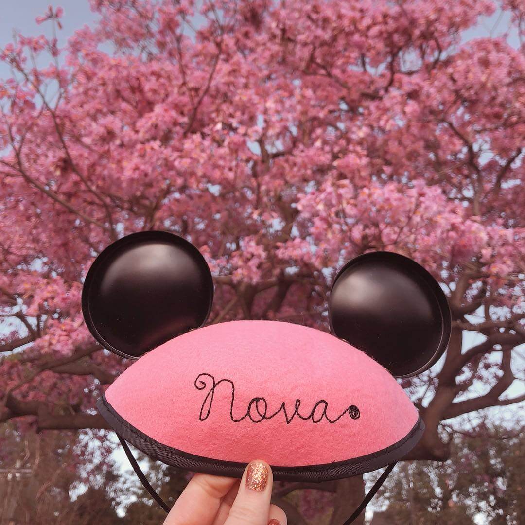
1
daily outfits
This is something I have always loved taking photos of. If you bought a new outfit, document it! You never know who may see that photo and get inspiration for an outfit of their own. Now that I’m a mom, it’s also fun to take photos with Nova and show what we’re wearing for the day (especially our matching outfits!).
2
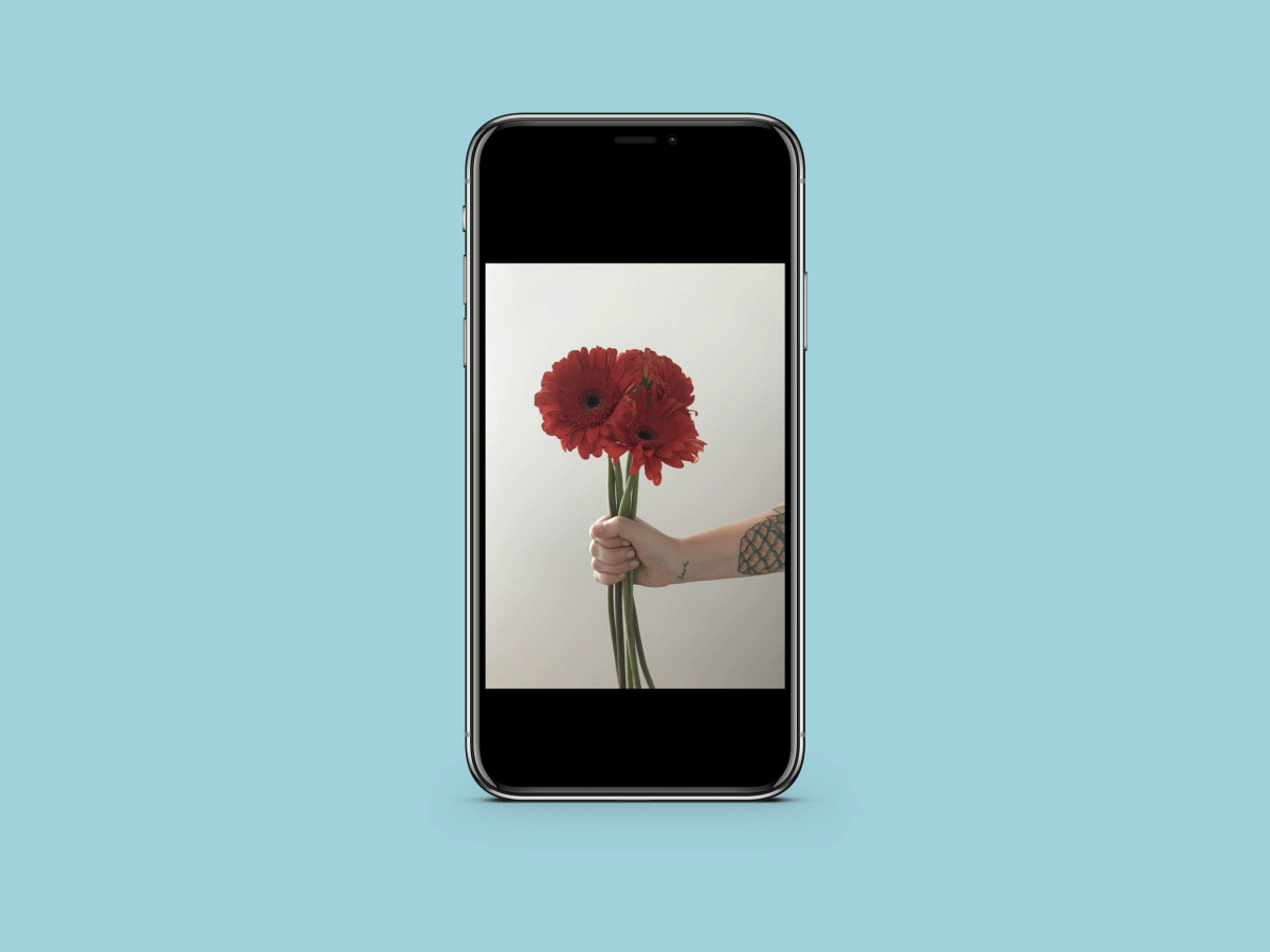
plants + flowers
This is one of the easiest things to take photos of! You can find beauty in nature just by stepping outside, so why not whip out your phone and snap a photo? If you want to something other than an up close shot of flowers, try holding them in a photo.
3
skies
This is another effortless thing to capture. You can take an amazing photo of the sky from just about anywhere. Whether you’re cruising in the car, taking a hike, watching the sunset, or looking out your bedroom window, just point your camera at the sky and snap away!
4
the changing seasons
Try taking a photo outdoors of the same thing or at the same angle for every season to see how it’s changes.
5
baking
Something about baking photos are so cute!! Maybe it’s because the desserts always look so appetizing? Don’t limit this to only baking though! Whatever your hobby may be, photograph the process of creating it.
6
interiors
Like I mentioned above, interiors have been something I’ve loved taking photos of ever since my Husband and I moved into our home. It’s so fun to show your home projects and things you’re proud of. (Not to mention before and after photos are so fascinating!!)
7
vacations
This seems like a given since everyone wants to document their vacations, but challenge yourself to take photos that are a bit out of the ‘norm’ while on vacation. Find inspiration around you and document the fun in your own creative way!
A series I’ve been loving to photograph lately is photos of my daughter making art. Creative play is very important to me, but it’s also a lot of work and can be discouraging when you factor in toddlers. I take photos of each one of our creative adventures and the ongoing series of memories we are creating keeps me motivated to keep adding more!
Here are some examples from my series- all edited with A Color story.
Here are some more ideas for things to take photos of:
-a project you are proud of at work
-a collection
-your favorite spots in your hometown
-nature hikes
-self portraits
-your friends and family
-animals
Choose a photo series that challenges you and brings you
closer to your goals! -Elsie
Hey guys! Rosie here to share some tips for taking a great iPhone photo. I used my iPhone for every photo you see on my feed, @rclayton, up until two years ago and I still use my phone for a bunch of shots I’ve recently posted. Smartphone cameras are incredibly powerful, easy to use, and are able to capture beautiful images. The simple tips below, combined with the filters and editing tools in A Color Story, can result in gorgeous photos. Let’s get started…
1
Be sure your camera lens is clean!
I usually wipe the lens with a microfiber cloth or, if one is unavailable, my shirt.
2
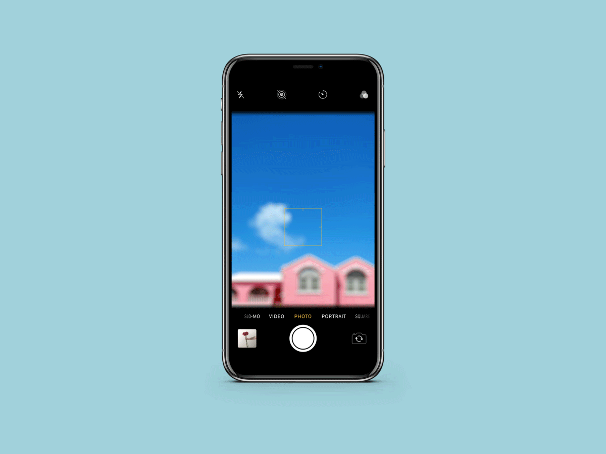
don’t use the zoom feature
It creates blurry, pixelated images. Just move up closer to your subject, if possible and needed. Avoiding the zoom option is also a great way to get used to moving while you shoot and capturing various angle options.
3
No flash ever!
If you’re in a dark setting, have someone shine their phone’s light onto the scene to illuminate the subject. Turn off artificial lights if you’re shooting indoors during the day. You can always use the brighten and exposure tools in ACS to bump up brightness later.
4
tap the screen to focus
5
center your subject
Or follow the rule of thirds for interesting composition. Also try to keep lines straight and vertical and horizontal perspectives as true as possible. You can also can adjust later in A Color Story.
6
shoot multiple photos to have options!
I never take just one photo, even if I’m shooting an interior space.
7
edit images in a color story to bring your photo to life!
I go to Tools first and then apply filters at the end.
I hope these simple steps are helpful! Feel free to message me @rclayton if you have any questions!
This website uses cookies to improve your experience. We'll assume you're ok with this, but you can opt-out if you wish.AcceptRead More