at home
At Home (by underthesycamore) is one of our most subtle packs, but great for lifestyle and indoor photography. Each filter creates a fresh new look to your photo without compromising skin tone or over saturating colors. This makes the pack feel cozy + clean. Here are examples of every filter in the pack (all at 100% opacity):

before

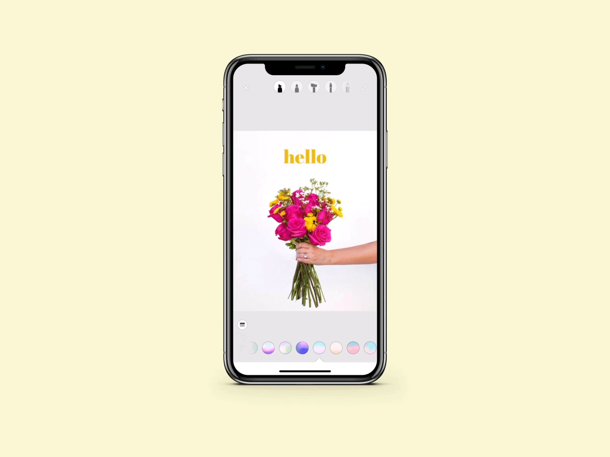
exhale
Brightens whites + boost in saturation. Great for indoor photos.

pool day
Overall brightens + mutes highlights.

welcome
Warmer filter + great for outdoor photos.

kick back
Another warm filter. Brightens highlights.

tire swing
Muted highlights + a slight blue tint. Great for outdoor photos.

create
Creates a slight warmth to whites. Overall brightens.

gather
Subtle pink tint.

petals
Adds a rosy tint to the shadows.

dirt road
Deepens contrast + brings warmth to highlights.

dream
Brightens whites + slightly mutes the highlights.

linger
Mutes the highlights. Great for indoor and lifestyle photos.

driveway
Classic black and white. Mutes shadows and brightens highlights.

nest
Overall brightens photo.
One thing we really love about this pack is that it’s great to do one-filter edits with! If you love taking photos to simply have memories and keepsakes, this pack is so perfect for that! Ashley seeks to find the extraordinary in the ordinary with her photography and it really shows in this pack. Here is a before and after example:
AfterBefore


This photo is edited with Exhale and really brightens the whites to give it a clean look!
You can find At Home in the app! You can download it for FREE if you sign up for our ACS+ membership. 🙂 As always, if you have any questions about the pack or have any suggestions of other tutorials you would like to see, reach out to us at hello@acolorstory.com!